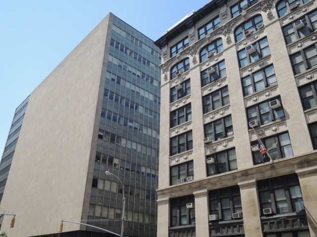
Blowhard, Esq. writes:
Of each pair, which do you prefer? Which would you rather look at every day? Which do you think has the more inviting and comfortable interior?
Click on the images to enlarge.
Blowhard, Esq. writes:
Of each pair, which do you prefer? Which would you rather look at every day? Which do you think has the more inviting and comfortable interior?
Click on the images to enlarge.


Is that Saks Fifth Avenue in the second picture?
LikeLike
No, the Lord & Taylor on 5th Ave.
LikeLike
Picture No 1:
For me, the modernist building is initially more striking and initially draws my attention maily because of the monolithic bulk of the stone facade, however there’s not much else.
The other building is more interesting, simply because of the amount of detail in the facade. An interesting point, I didn’t notice the air conditioners for a while, simply because they blended in as just another detail, though they do stand out when you look for them.
The second building reminds me of a room I built once. It was something similar to this.
The interesting thing about this room was that it looked better a “little messy” than it did when it was completely tidy. Having a few books and papers lying around actually improved the “feel”. On the other hand, I lived in minimalist interiors where everything has its place and the odd book or magazine left out really draws attention to itself by being outside the gestalt of the place.
Picture No 2: Ditto. The building on the right overwhelms by size and disciplined lack of detail. It’s massive and austere but also boring. The one on the left has more shadow detail and is more pleasing to look at.
LikeLiked by 1 person
One has to be careful with terminology here. True, the one building is newer than the other. But it’s no longer ‘modern’ either. These are ’60’s, ’70’s ideas. It wouldn’t make sense that we’re flying around in ion drive saucers 500 years from now and building 19th century buildings.
LikeLike
shut the fuck up
LikeLike
Hey agnostic, you shut the fuck up. Idiot.
LikeLike
@weak stream
The funny thing about 19th Century buildings is that they referenced buildings built in the zero century and BC times, so in a sense, they were building what you said didn’t make sense.
What interests me is the biological response to pattern, colour, shadow, massing and their interrelationships. It’s my opinion, that what’s considered traditional architecture did a better job of it than the moderns have. It’s not so much a question of taste preference as it is of “visual ergonomics”. I think it is important not to associate a style with the times, rather its important to recognise what constitutes a pleasing building design. The Victorians had no problem borrowing from past times and applying the aesthetic choices to contemporary exigencies. I mean, no Roman ever built a railway station, yet they were happy to use the design elements of Roman architecture in their “space age” stations and by and large, the designs have aged well.
The modern Penn Station, on the other hand, is a shithouse. It’s awful. A what makes it ugly is not it’s newness, rather the design elements chosen. The aesthetic choices are just wrong. I don’t think anyone except Frank Gehry would decry its demolition. It exists to make his shitboxes look reasonably good.
Modern buildings are a bit like the Gerrit Rietveld chair”, considered a masterpiece of design by the design experts but it’s awful to sit in. The chair, in my opinion, is therefore a failure. Modern architecture is all about telling people that there is something wrong with them for not finding the chair comfortable. It never occurs to the architects that there is something wrong with them.
Like I say, it’s all about visual ergonomics.
LikeLike
Slumlord, for sure I agree with some of your ideas and modernists like Le Corbusier were arrogant in their idea of imposing uncomfortable furniture on people. But a good designer can do both. Create beauty, use and comfort. I think a more apt comparison might be between old cars and new ones. New ones are modern and comfortable. And, of course, the old, and really old ones, are classics.
LikeLike
One thing that really stands out about the Modernist buildings when juxtaposed with a more traditional type is how artificial they look because of their absence of segmentation.
The one in the first pic is mostly a single undifferentiated slab. It’s not just that it lacks details, motifs, etc., which are ornamental. It lacks different functional parts along the vertical dimension like a ground-level layer, middle layer, and near-the-roof layer — it lacks a proper roof as well — and it lacks vertical support-looking elements, windows, etc.
It’s like standing up a really tall 2×4 in place of a full tree, with roots, trunk, branches, twigs, foliage, flowers, fruit, and so on, all visible. It looks totally fake, unconvincing, and off-putting.
The one in the second pic is only slightly less phony-looking. It does have zillions of windows which are like cells that form into horizontal rings, and one ring piled on top of another. But there still is no sense of these cells forming different functional organs that make up an entire organism (base, roof, windows, etc.).
You might liken it to an insect hive, but those only look so cell-like on the inside. A beehive, anthill, wasp’s nest, termite mound, or whatever, is more blobby and irregular on the outside.
Modernist buildings just look like what some bored kindergartner built out of Legos in order to finish as soon as possible, and only having two types of blocks to build with.
LikeLike