
Paleo Retiree writes:
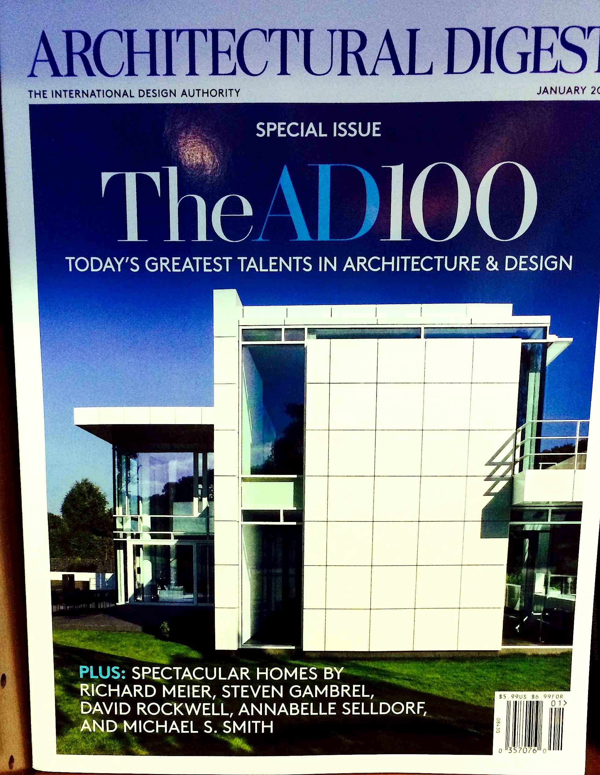
In a daring editorial move that will unquestionably rock the world of architecture to its very core and cause all its fans and practitioners to re-evaluate their standards, tastes and practices, Architectural Digest has chosen to feature on its January cover a new house by Richard Meier — the already-hypercelebrated creator of a large number of geometry-heavy white-and-glass boxes.
Why on earth are so many in the field of architecture so enamored with geometry, abstraction and cold materials? How on earth did this situation arise? What on earth might be done to combat it? And where are the blogs, magazines and online conversations that treat contempo architecture with irreverence and mockery it demands and deserves?
Related
- Paul Goldberger visits with Richard Meier. Meier “took the vocabulary of modernism, stripped it of its harshness, and spun it into objects of almost breathtaking beauty,” writes Goldberger, barely managing to get the words out past the dick he’s sucking.
- A fab — if I do say so myself — interview that I did with the architectural theorist Nikos Salingaros: Part One, Part Two, Part Three, Part Four, Part Five.
- Leon Krier is the genius of anti-modernist contemporary architecture from a neoclassical point of view. He’s a fantastic writer as well as a brilliant designer. I loved this book of his, which I found both mind-blowing and charmingly urbane. More.
- James Kunstler shares my admiration for Krier.
- Some verrrrrrrrrry grudging respect for Krier from an establishment type.
- Tom Wolfe and James Kunstler are great guides to the insanity. Kunstler’s very lively website.

I was just at the Getty recently, Meier’s “masterpiece,” and took a bunch of pictures. I’ll post them soon.
Also, I got into an argument with Goldberger on Twitter once. I think I held my own, but I could be misremembering things. I should try to dig that out.
LikeLike
Looking forward to both of those.
LikeLike
Funny how the establishment thinks it’s being radical by making the same damn white box over and over again. I guess it works for them because, by and large, the public still hates what they’re doing. Which is the whole point, right?
LikeLike
Jewish architects… it’s like a Chinese-American NBA team, a black Dr. Spock, or a Pan-Minnesotan gangsta rap and booty battle squad. We’re allowed to laugh at the latter, why not the former?
LikeLike
Ha Ha (?)
LikeLike
Look at that vainglorious subtitle:
THE INTERNATIONAL DESIGN AUTHORITY, BITCHES
AD has been around since 1920, yet only adopted subtitles in 1966, and not very pretentious ones at first. “The quality guide for home decorating ideas.” In the ’70s and ’80s, they upgraded from “home decorating” to “interior design,” then in the 2000s they became ashamed of the modifier “interior” and went with straight “design.” In 2011, they tacked on “authority.”
More like Architectural Bombast.
LikeLike
There’s nothing harmful about using geometry. Employed by a normal human being, geometry gives the substance some style. But it falls into one of two types:
1) A representational image of some real-life thing, that has had its lines and/or volume geometrically stylized. Preferably of a natural kind. Egyptian columns that resemble lotus or papyrus plants. Art Deco figures, sunbursts, etc.
2) A (more or less) non-representational image made up of repeated geometric motifs, whose arrangement strikes up a rhythm. Preferably with a variety of scales, many pieces within each scale, and a regular (rhythmic) configuration. The Greek key, plaid / tartan, etc.
The off-putting use of geometry satisfies neither: it is abstract, and it shows no catchy motifs or curiosity-provoking variety of scales. To the extent that some pieces are of different sizes, there aren’t enough of them at each scale to establish it as a repeated scale choice — like just one small element thrown in with mostly medium or large elements — and their configuration is not regular — some pieces here, some pieces there. It’s fingers hammering the keyboard at random.
LikeLike
There is perhaps one other category where geometry plays. Architecture is also about structure which always involves geometry. Expressing structure instead of hiding it or obliterating it has been a driving force in modern architecture (not to say that the International Style Architecture on AD’s cover falls in that category).
Last night I watched a PBS Nova piece on Brunelleschi’s dome in Florence. The piece focused on how such an ‘impossible’ structure was designed and built. However, the structural magic behind it was completely hidden and subservient to the creation of a symbolic icon like no other. Perhaps that’s the reason for it’s place in architectural history but for this observer, the ‘how’ it was built is what makes Brunelleschi’s effort magical.
I was thinking that technology and the arts were perhaps one in the same back in Renaissance days in the sense that they both reflect humankind’s intellectual progress. It made me think about the controversy over Vermeer’s use of lenses and mirrors to create his near photorealistic paintings. Since then we’ve teased apart the arts and technology and so many other things such that it seems difficult to fully appreciate the magic of such work produced when all those things combined were nothing less than the leading edge of intellectual development.
LikeLike
Line of the week, possibly the month.
LikeLike
The Greeks look at geometry and you get the acropolis, early Americans do the same and we get federalist stuff, this guy does it and we get pure distilled shit. Todays question: Should modern architects be crushed by a capital of the a. ionic b. doric or c. Corinthian order. Please state why and show your work.
LikeLike
Pingback: A Day at the Getty Center | Uncouth Reflections
As millwright or practical architecture, it doesn’t look bad. The shiny whiteness makes it easy to spot damage, and cuts the giant air conditioning bill you get from all the glass. Simple geometric uniformity makes it easy to spot damage and sloppy workmanship. As to an architecture magazine sucking up to a rich architect – when was it not ever thus?
LikeLike