
Fabrizio del Wrongo writes:

If you haven’t been living in a cave (i.e. away from social media), and you’re at all interested in this type of thing, you’ve seen the trailer and poster for the new Star Wars movie, entitled “The Force Awakens.” It’s the latest blockbuster-type thing to use its marketing campaign to draw fawning, quasi-hysterical reactions from a yearning-to-be-milked base of nerds and superfans. For years people have joked that movies are turning into excuses for their trailers. In the post-“Fury Road” world, where the sell seems the raison d’être of popular culture, it’s less a joke than a serious criticism. When director J.J. Abrams delivers the finished product, will it live up to its two-minute commercial? If it doesn’t, will the faithful be able to admit it without collapsing their worldviews?
But enough of that. The point of this post is the poster. The first regular-release poster (what used to be called the “one-sheet”) for “The Force Awakens” is pictured above. What do you think? My first reaction was something along the lines of, “Wow, too complicated.” Though the design seems intended to evoke the style of Drew Struzan, it has none of his signature clarity or texture. Character likenesses pile up in a confusing, digitally-worked-over-looking mass, which culminates in a portrait of heroine Daisy Ridley. That image of Ridley is, I suppose, the chief thing to which your eye is drawn, but it’s not highlighted or emphasized in a manner that would encourage you to linger on it. But then it’s hard to emphasize a graphical element when the work in question doesn’t have a background. Just about everything in this design seems like a foreground element. It’s all vying for your attention.
In case you’re wondering, the poster depicts 13 characters, provided you count the white stormtroopers (are they still called stormtroopers?) as only one character.
That gives it a character score of 13 (more on that later).
That surfeit of characters confirms a suspicion I’ve harbored concerning this movie since details about it started to leak on the internet. Specifically, I fear the movie will suffer from what I like to call characteritis.
Ongoing series have a tendency to develop characteritis, as their creators struggle to inject them with new life while maintaining a connection to their legacies. A good example is the Indiana Jones series: After the second entry, “Temple of Doom,” was deemed a disappointment, Lucas and Spielberg placated fans by making “Last Crusade” a partial redux of “Raiders of the Lost Ark.” They brought back “Raiders” characters Sallah and Marcus Brody, seemingly just to have them around. They’re a distraction. But it was in the 2008 “Kingdom of the Crystal Skull” that an overabundance of characters really became a problem. A long gestation period produced a movie that felt like a mishmash of screenplays and ideas. Karen Allen’s Marion Ravenwood was back, though she wasn’t given much to do. And John Hurt was dropped into the action, presumably to please fans who’d been speculating about Indy’s mentor since 1981. Pleasing fans is a noble aspiration. But not when it amounts to box-ticking. There’s a point at which fanservice gets in the way of what you’re trying to do. By its final third, “Crystal Skull” felt like it was dragging around a gaggle of characters, like a wedding limo drags tin cans.
I guess what I’m trying to say is that characteritis tends to be a sign of entropy, a lack of focus or vision, and a willingness to subordinate creative decisions to the demands of marketing. To me, the poster for “The Force Awakens” says: “Look, we are giving you new stuff! But we haven’t forgotten the old stuff! Hey, guys, this is the Star Wars you’ve been waiting for!” Say what you will about George Lucas and his prequels, he had the balls to start from scratch with “The Phantom Menace.” That movie featured only one legacy character in a major role and no recognizable vehicles; even the music carefully avoided relying on John Williams’ famous themes. But Star Wars is now controlled by Disney, and Disney is not in the business of starting from scratch. In particular, they’ve been shameless in the way they’ve trotted out the Millennium Falcon and Harrison Ford — the poster might as well include a call out reading “Now with extra Han Solo.”
With all of that in mind, I thought it would be fun to take a look at each of the theatrical Star Wars posters, assign them a character score, and consider their emphases. I haven’t included teaser posters since they tend to have their own unique set of design parameters. I also didn’t consider oddball releases or things that lack original art, like the so-called “birthday cake” poster and the various re-release posters for “Star Wars.”
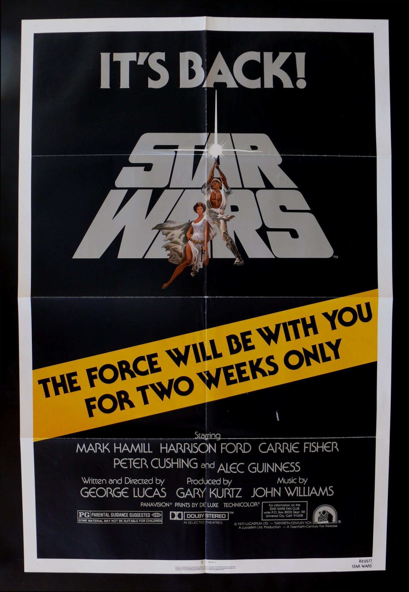
“Star Wars” Style “A” – 1977

Character score: 5.
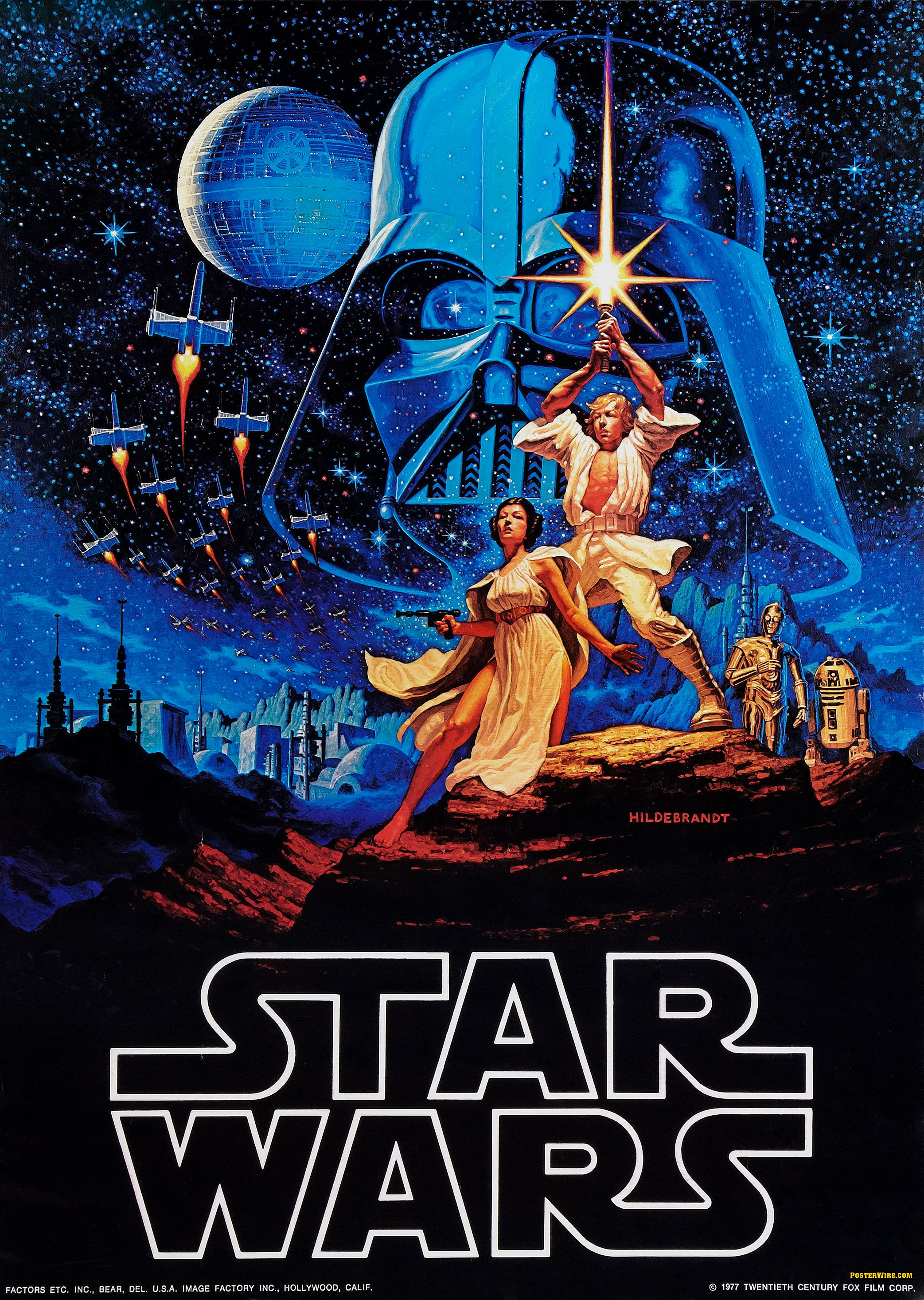
It’s worth noting that C-3PO and R2-D2 were late additions, having been painted into the original artwork after the Hildebrandt Brothers depicted them on their famous reworking of the Jung art. I think the composition works better without the droids.
The style “A” poster is one of the most iconic movie posters ever designed. But is it iconic because of the popularity of the movie it represents or because it’s a great piece of design? I think it’s a great poster, even if, as many have pointed out, it doesn’t capture the tone of the movie. Artist Tom Jung based the image on the fantasy work of Frank Frazetta, and it successful apes Frazetta’s fever-dream sensuality. Of course, “Star Wars” is largely devoid of sensuality, but who says movie posters must be truthful? The simple composition is the kind of thing that hangs in your memory. And to the target audience of teen and pre-teen boys, the image promises sweeping adventure, non-icky romance, and an epic struggle between good and evil. As an invitation to fantasy, it’s pretty darn successful.
“Star Wars” Style “B” – 1977

Character score: 7
Luke counted twice. I didn’t count the small figures of Han, Luke, and Chewbacca, as they’re part of a background vignette.
This is really the style “A” half-sheet, but it’s frequently treated as the style “B” poster because it features wholly original artwork. Like the one-sheet, it’s by Tom Jung. I think the poster works, even if, considered element by element, it’s very hodgepodge-y.
“Star Wars” Style “C” – 1977

Character score: 9.
I think the design would work better without the floating heads of Alec Guinness and Peter Cushing.
Unlike the style “A,” this poster captures some of the movie’s spirit. It was executed by Tom Chantrell, who was known for his work on behalf of big action/adventure films.
“Star Wars” Style “D” – 1978

Character score: 10.
Stormtroopers and jawas are each counted once. Obi-Wan Kenobi was a late addition, meaning the original poster featured nine characters.
If the style “A” emphasized fantasy, and the style “B” emphasized action, this style “D” design emphasizes old-fashioned matinee swashbuckling. These days it’s hard to believe, but “Star Wars” ran in theaters for over a year. This poster was intended to freshen up the ad campaign. It’s by Charles White and Drew Struzan.
“The Empire Strikes Back” Style “A” – 1980

Character score: 7.
The poster originally featured more characters, but they were wisely painted out in favor of a simple image. This led to problems: Billy Dee Williams (or his representatives) complained of being left off the poster. Had I been calling the shots, I would have gone even further in the direction of simplification, and done away with the figures of Chewbacca and the droids.
This is probably my favorite Star Wars poster. The dark tonalities and romantic emphasis that seemed incongruous on the “Star Wars” style “A” poster are justified in this case — “Empire” was a more emotional and sweeping movie. The art is by Roger Kastel, who borrowed the kissing motif from a “Gone with the Wind” poster.
“The Empire Strikes Back” Style “B” – 1980

Character score: 10
Luke counted twice. Stormtroopers counted once.
I don’t particularly like this style “B” design for “The Empire Strikes Back.” The elements seem rather haphazard in their arrangement, and Mark Hamill looks like a rotoscoped character out of one of Ralph Bakshi’s animated films. The one element I like: those TIE Fighters zooming out of Darth Vader’s cape. The art is by Tom Jung.
“The Empire Strikes Back” Re-Release – 1981

Character score: 6.
This reworking of Jung’s style “B” art was used for the 1981 re-release of “Empire.” By that time Yoda was no longer a closely guarded secret, so he features prominently in the design. The new portrait of Hamill is a big improvement.
“The Empire Strikes Back” Re-Release – 1982

Character score: 6.
The Jung style “B” art was reworked yet again for the movie’s ’82 release. Han Solo now occupies as much space as Luke. By ’82, Harrison Ford was a star.
“Return of the Jedi” Style “A” – 1983

Character score: 0.
Yeah, that’s supposed to be Luke holding the lightsaber, but I’m not counting the hands as a character.
I know we’re supposed to love this poster, but I’ve always found it pretty lackluster. Cool concept, mundane results. There’s too much blue, and the tone is too reverent — it looks like an ad for some new-age, spiritual thing. When you get right down to it, this is a teaser poster. Art is by Tim Reamer.
“Return of the Jedi” Style “B” – 1983

Character score: 9
I didn’t count the jawa in the background.
I think this is a great poster. It boasts terrific portraits (especially that ferocious image of Hamill), a dynamic composition that leads your eye up and into the background, and a light-to-dark tonal gradient that adequately represents the movie. The ewok is perhaps a tad too large, but that’s a quibble. Art is by Kazuhiko Sano.
“Return of the Jedi” Re-Release – 1985

Character score: 8.
This poster, for the 1985 re-release of “Jedi,” is, to me, the worst theatrical Star Wars poster by a long shot. Picking it apart would be too easy. But allow me to ask one question: Why is R2-D2 giving C-3PO a blowjob?
“The Phantom Menace” – 1999

Character score: 8
I counted the background image of Darth Maul. Maybe I shouldn’t have.
By Drew Struzan. Pretty effective, I think.
“Attack of the Clones” – 2002

Character score: 8.
I didn’t count the stormtroopers.
Also by Struzan. Simple, classy, and nicely composed. An extension of the “Phantom Menace” poster from three years prior.
The worst that can be said of Struzan’s poster work for the prequels: it’s somewhat unsensational.
“Revenge of the Sith” – 2005

Character score: 9
Obi-Wan and Anakin counted twice.
Struzan capped his work on the prequel posters with this piece for “Revenge of the Sith.” I’m guessing someone mucked with his original product, as the design is uncharacteristically out of kilter. In particular, the image of Darth Vader doesn’t integrate with the rest of the composition. (Google yields an explanation.) My guess is that the original design featured Darth Vader as a background element in a manner similar to that in which Darth Maul is featured on the poster for “The Phantom Menace.” But then someone at Lucasfilm decided a change was needed in order to better communicate the thrust of the marketing campaign, which can be summarized as, “Hey, guys, this one has Darth Vader in it!”
* * *
In summary, the 14 Star Wars theatrical posters issued prior to “The Force Awakens” featured an average of seven characters. “The Force Awakens” poster features 13. Does this mean anything? It’s hard to say. But I think it’s interesting.
Before wrapping up I’d like to mention one more poster, this one created for the Australian release of “The Empire Strikes Back.” I mention it because I think it’s an example of a poster that uses complexity and an abundance of characters to great effect.

Why do I think this poster works better than the “The Force Awakens” poster? I’m not entirely sure. But it helps that artist Noriyoshi Ohrai relegates the area of busyness to a modestly sized triangle in the center of the composition. Also, Ohrai’s use of color is so intriguing that your eye keeps wandering back into and over the composition. This is complexity that invites exploration.
Comparisons aside, that portrait of Billy Dee Williams is truly inspired. I think it’s Ohrai’s invention, as it’s unlike anything I remember from the film. Yet it captures something elemental in the Lando character.
As I was putting together this post, Noriyoshi Ohrai passed away. His complicated, detail-heavy compositions may have influenced contemporary poster artist Tyler Stout.
Related
- If you’re interested in Star Wars posters, “The Star Wars Poster Book” is a terrific resource.

You left out the main scar on the one for Phantom Menace — a puzzled, wimpy Millennial smack in the middle of the poster. This ain’t no Christmas pageant, dork — go home! At least it looks like Obi-Wan is aiming to cut the little shrimp in half.
And look at the two lovebirds in the one for Attack of the Clones — both staring in disconnected directions, unaware of each other’s presence despite being close together. Unlike the Empire one where Leia’s staring up into Han’s eyes. I think the poster artist was trying to warn us in advance about how off-putting their utter lack of chemistry would be, in a movie that revolves around their “romance”.
LikeLike
The one for Force Awakens is too photorealistic in the portraits — more like what they do for action / sci-fi than for fantasy / horror. Sure they made a token effort to de-slick-ify it, but it just looks like someone photographed it with an iPhone and posted it to Instagram with a “hand-drawn illustration” filter.
Another reminder that anyone expecting fantasy, myth, etc., like the original trilogy had, should expect another paint-by-numbers action / sci-fi flick from J.J. Abrams, like the Star Trek reboots.
Also LOL at how lightsaber-y the new poster is, not unlike the one for Revenge of the Sith. They should just drop the pretense and start marketing this as That Movie with the Lightsabers: Part 7.
LikeLiked by 1 person
A very entertaining run through of a lot of bad posters. I’ve enjoyed the trailers for the upcoming film, though I’m leery of the oh-so-progressive requirement of the black hero and grllll power heroine. And do we have an inter-racial romance in the works? My money says yes.
LikeLike
Wasn’t Princess Leia an action-heroine, too? As for the black guy, why the hell not? Were you also leery of Billy Dee Williams as Lando?
LikeLike
A bit of a digression, but since I haven’t seen anyone else mention this, I’ll post it here…
The thing that struck such a bad note with me in the new the new Star Wars trailer is, near the end, when that whispery female voice that’s meant to sound serene but feels a little foul says, “The force is calling to you…just let it in.”
Passivity, the obliteration of volition. The force is not something that’s a part of your inner being that you can access (“Use the force, Luke”) but something that invades you from the outside.
Why wasn’t the line “The force is calling to you…just listen.”? Which might connote active participation, heeding the call to adventure.
Is the coded message, “Just lay back and think of Disney?”
LikeLike
That sounds more like a spirit possession religion. In the West it manifests as obsession with being touched / moved / overtaken by the Holy Spirit, a la Pentecostalism.
Maybe the writers are trying to tap into contempo religious mores, which were not very mainstream in Western Christianity back in 1977.
LikeLike
An epic story has to connect with the Jungian themes like spirit possession. The Dybbuk may be with you.
Regarding the increasing complexity of the posters, you may attribute it to (1) the Flynn effect, (2) the saturated media environment the new generation of public grew up, (3) the much improved graphic technology and possibilities. I wonder how may look the Empire’s flag.
LikeLike
As a general observation: the problem with the newer posters (Attack of the Clones, the Phantom Menace) is that there is no overwatching presence. In the earlier posters, the characters-even the main characters-are small. The whole image is of small humans trying to persevere against BIG forces (the empire, Darth Vader). Kind of like WWII overhanging everything-this grand historical event that people are just trying to survive, understand, and do their best in. Even the original Star Wars poster, with the heroic Luke and sexy Leia: two small figures: the universe (the Empire) and Vader are the looming presence, and thus the frame, of the story.
The modern posters say ‘people people celebrities!!!’ The big events are either not there at all (Attack of the Clones) or obscured (The Phantom Menace-you have to look twice to even see Darth Maul). The Attack of the Clones, by enlarging the two leads’ images, makes the movie look like a space romance-The Blue Lagoon in space (maybe it was-I never saw it). And the Revenge of the Sith draws your eye to two shaggy-haired blonde guys-no sense of grand historical events at all. The Force Awakens? Same thing. I just see a kick-ass teenage girl story (the Hunger Games redux), with a few other random characters/swordfights/laser beams thrown in. No sense of a sweeping epic.
LikeLike
“That image of Ridley is, I suppose, the chief thing to which your eye is drawn, but it’s not highlighted or emphasized in a manner that would encourage you to linger on it.”
Until you drew my attention to her presence on that poster, I never noticed she was even there. It seems odd in retrospect, but there are so many other details included in that poster, I simply never noticed her. Which may help to explain why I didn’t realize the principal character in the film was a woman, until the day before yesterday.
LikeLike