
Paleo Retiree writes:
During a cross-country trip the other day I found myself killing time at the Dallas airport. I looked up from my book and found that I was sitting by the side of a kind of central courtyard that … Well, here’s a collage impression of what the area looked like:
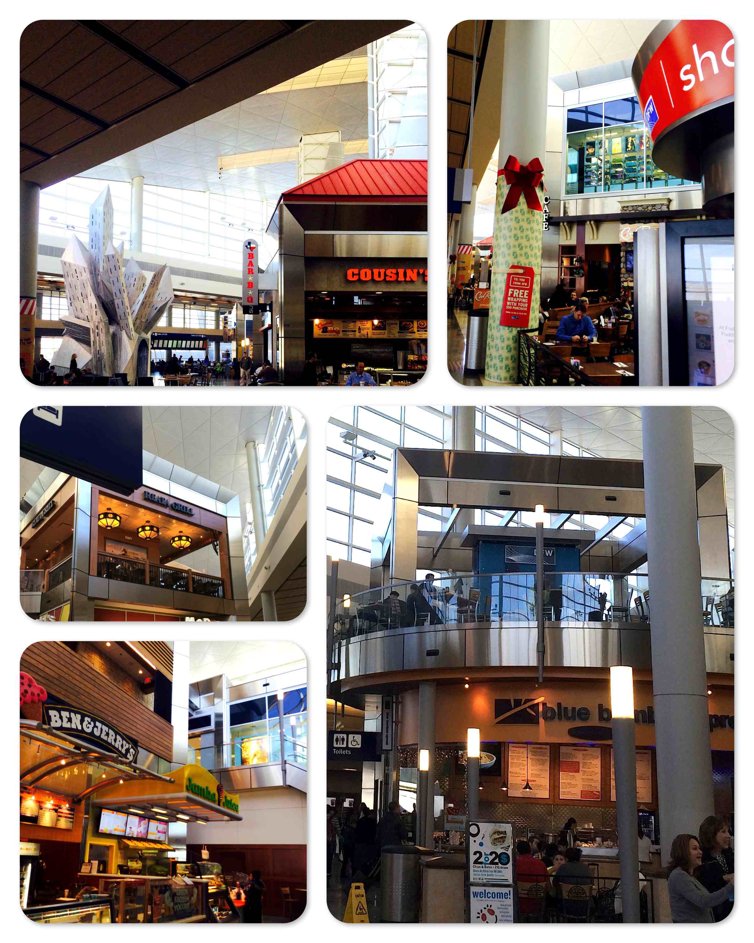 I was mainly reminded of two things by this courtyard. One was the kiddie-play areas featured by some McDonald’s restaurants; the other was co-blogger Eddie Pensier’s recent posting about some awful contempo buildings in Melbourne. Corporate/governmental postmodernism … Zaniness and playfulness every which way you look … The blight of public art-style creativity … The “We’re being treated like children!” angle of it all really knocked me on the head.
Questions Du Jour: Is it a great thing that our elites supply distractions and amenities a-plenty to us to provide us with pep, calories and cheeriness? Or is it an outrage that our betters are as determined as they are to treat us like cranky babies? Is transforming our environment into a giant playpen making us happier by reinforcing our connection with the child within? Or is it an infantilizing force that needs to be resisted?
Related
- A funny Onion article on the general theme.

It would be interesting to speculate on this in terms of A Pattern Language. That way of thinking leads to a rejection of forms that are somehow not congruent with our instinctive way of apprehending forms. Modernists often like being challenging, or subversive, or just plain famous by standing out from the crowd.
But what of these shapes in your pictures? I take it your pictures are meant to suggest we are in our cribs looking up at a mobile with a bunch of differently colored shapes. But is that part of our pattern language, too? Museums can be designed to offend the visitor, but you’d think malls would be built with the visitor in mind. If that’s the case, might this not just be another case of a language that is concocted that appeals to people?
Me, I’d have to be persuaded that it is inherently infantilizing, even if it is appealing.
LikeLike
I wonder if C. Alexander should have made more of a point that the shapes, ratios, procedures and such that he advocates making use of are inherently appealing to *adults*.
LikeLike
The worst offender here is the signage. It’s so in your face, interrupting the flow of things. It’s even worse than “ads everywhere” because they’re building entirely new surfaces-for-ads to jut out from the main structural elements.
There’s the vertical marquee in the top left (“Bar-B-Q”), multiple horizontal marquees in the bottom left (Ben & Jerry’s, Jamba Juice), a standing sign in the bottom right (“2 for 2$ … welcome!”), a cylindrical wobbly tower thingie in the top right (“sho…”), possibly another vertical marquee in the top right (“CAFE”), and who knows what else.
Signage should be flat against the facade, otherwise it feels like a giant pair of arms lunging down and out, tugging intrusively on the sleeves of passersby in order to launch into their pitch.
“Hey man, you want some Jamba Juice? Right over here, man, we’ll hook you up. Don’t pay no mind to that Ben & Jerry’s sign tugging on your other sleeve, we got everything you need. Here, right this way, man, lemme show you inside…”
Signs that jut out from, or stand apart from, the main building are a cancerous growth into public space. Thus, they only proliferate when people care less and less about public spaces, because they spend so little time there, preferring the warmth of their private domestic cocoons.
LikeLike
A reminder of how cancerously competitive the business owners were about their signage during the last period of cocooning, the mid-century:
http://library.duke.edu/digitalcollections/paverjohn_PAV0136/
That, along with garish billboards blotting out the landscape along highways, gradually got rolled back after the 1965 Highway Beautification Act, and were absent during the ’80s. Only with the return of cocooning have our public spaces become overgrown by competitive signage once again.
And some reminders of how pleasing malls were back in the ’70s and ’80s. No jutting signage, no wacky whoring for attention. There was enough excitement from the commotion of the crowd, the jungle-like density of plant life, and moving water.
LikeLike
OFFTOPIC: Paleo Retiree your a fellow WNY’er right? The absolute silliest looking building I have seen in the area is the public library in Akron, it clashes with its surroundings worse than any thing I’ve seen (the upside of a dearth of economic activity is apparently a dearth of architectural activity), it’s more painful viewing then the last 15 years of the Bills. . If you want to see glass and iron done right check out the botanical gardens in Olmstead park in Buffalo, heaven on earth very Eifel. If you want an example of brutalism on large scale from the ground up building after building check out the UB north campus, just due to the amount of buildings it evokes a response. the dorms are brutalist cubism.
LikeLike
Pingback: Eyesore Du Jour: National Museum of Australia | Uncouth Reflections