
Fenster writes:
Have you noticed the font style for previews of coming attractions has changed?
The old:
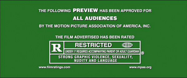
The new:

This article notes the difference.
The article quotes a font person who said it looked like Gotham, but that’s not right.

The MPAA itself said the font is Myriad-Pro, and if they say so I guess I believe them but that also seems off. The “O” in Myriad-Pro is not perfectly circular, the way the new preview sign has it.
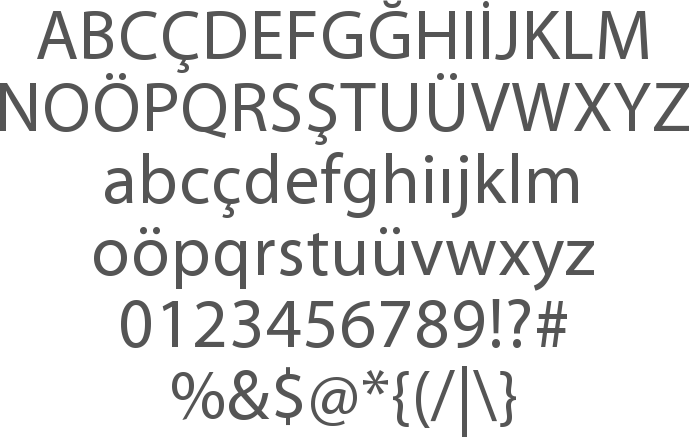
It reads to me like the echt-Brit font Johnston, the London Underground font.


Also reminiscent of the “Keep Calm and . . . ” messages seen everywhere nowadays, a font which looks like another echt-Brit font called Gill but which was apparently hand drawn in WW2 for the original poster.


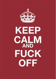
Obviously a cheap American knock-off
Do you suppose the ubiquity and popularity of the “Keep Calm” series has caused the MPAA to jump the pond?

Wes Anderson influence?
LikeLike
Could be. The Slate article notes the Wes Anderson similarity, but a font person says it is not Futura, which is apparently Anderson’s font.
http://www.slate.com/blogs/browbeat/2012/05/24/wes_anderson_bingo_play_along_with_moonrise_kingdom_using_our_bingo_board_generator_.html
LikeLike
I like Optane meself…..
LikeLike
Gill, Johnston, or some clone thereof is the Obama Permanent Campaign Typeface.
LikeLike
damn euro socialist wannabe
LikeLike
Good looking font with a deco feel. Much warmer than the old one.
LikeLike