
Paleo Retiree writes:
A return to my ongoing project of documenting what I think of as architectural “crap space” — bits (as well as sometimes, alas, huge stretches) of our designed-and-built environment that have zero life whatsoever.
First off, I’d like to admit that I have an agenda, and I’d like to spell it out. Whether something we call “life” is present or not in a cultural creation hardly qualifies as a technical, let alone a quantifiable, matter, yet — especially where buildings, neighborhoods, towns and cities go — it’s something just about anyone with common sense can detect.
Pushed to the wall, in fact, I’d argue that the presence or absence of life may well be the most important factor where any cultural creation goes. Life — or maybe better “livingness” — can be a debatable thing, of course, especially when put under a microscope and fought-over by sophists, cynics and opportunists. But, as far as I’m concerned, that isn’t a reason to ignore the question — let alone to dismiss it as as a laughably woo-woo thing — but to discuss it in an ongoing way. Why? Because the presence of livingness promotes and attracts further life, while the absence of livingness depresses and repels further life. Yet it seems to me that 90% of discussions about culture fail to wrestle with this basic livingness-or-not question. Instead they either fall into the trap of discussing indisputable things — brilliance, flashiness, efficiency — or they tumble into relativity and subjectivity of the “well, I dug it, but you may not” sort.
I’ll get to the snapshots after making one further point, which is that, while livingness’ presence or absence might be, in some cases, rather debatable, in other cases it’s hyper-obvious. Hence my focus here on crap space. Plus, hey: maybe there’s something to be learned from examples where livingness is flagrantly absent.
So here’s today’s carefully curated selection of crap space. What are the giveaways that this space — a stretch in front of a Manhattan apartment building — lacks livingness? And what are the factors that contribute to this non-livingness? If this space could talk, what would it be saying to you?
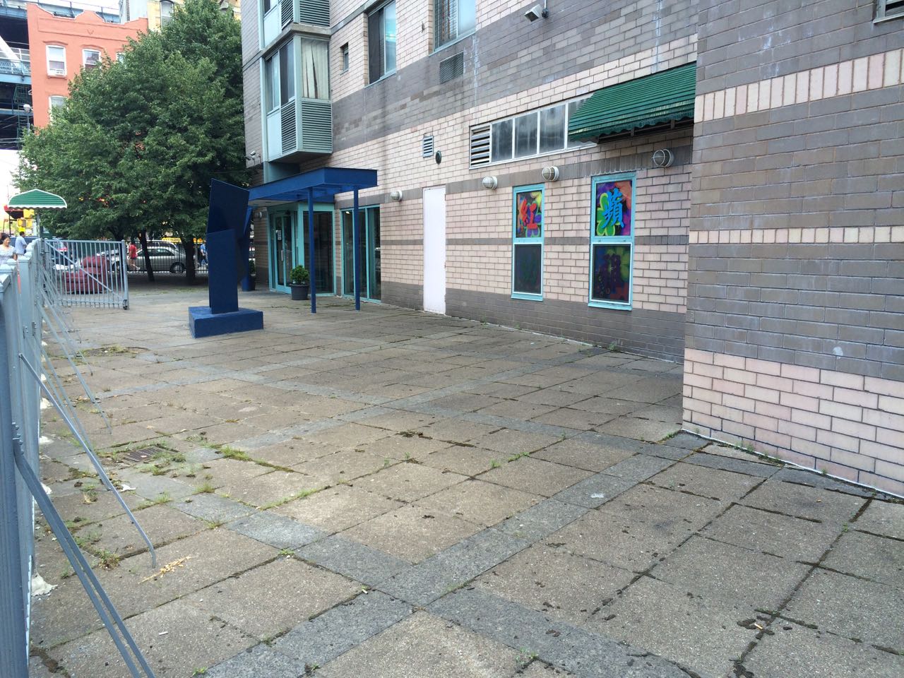
Does it say “KEEP OUT — Danger!” Or does it say “Enjoy yourself”?
One reason this space seems dead is that, despite a perfectly pleasant day, it’s unused. Another is that its intended purpose seems rather hard to grasp. What did someone once imagine the benefit or the point was of emptying out all this square footage?
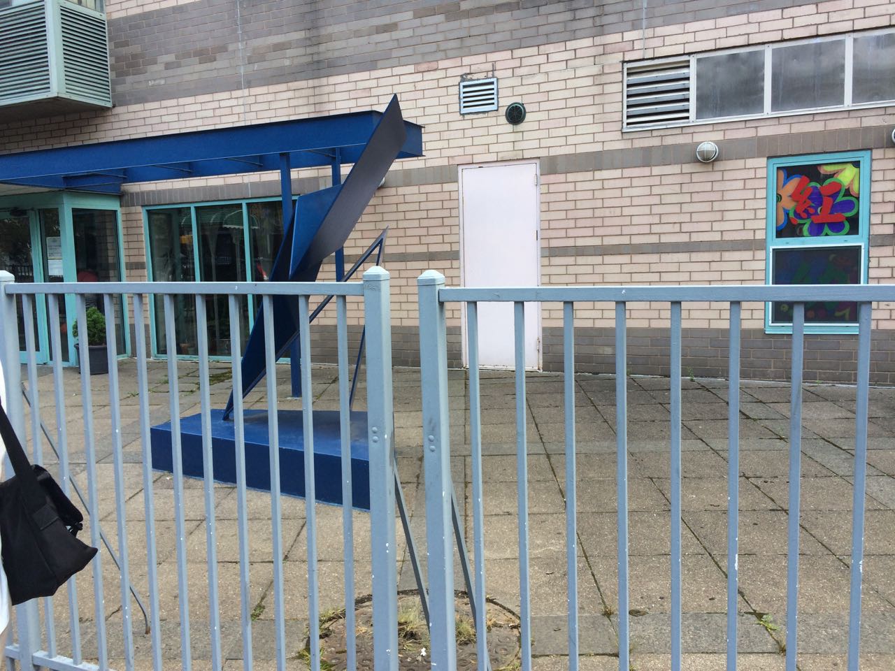
To my mind the ugly/cheery blue metal fence radiates half progressive elementary school and half country-club prison.
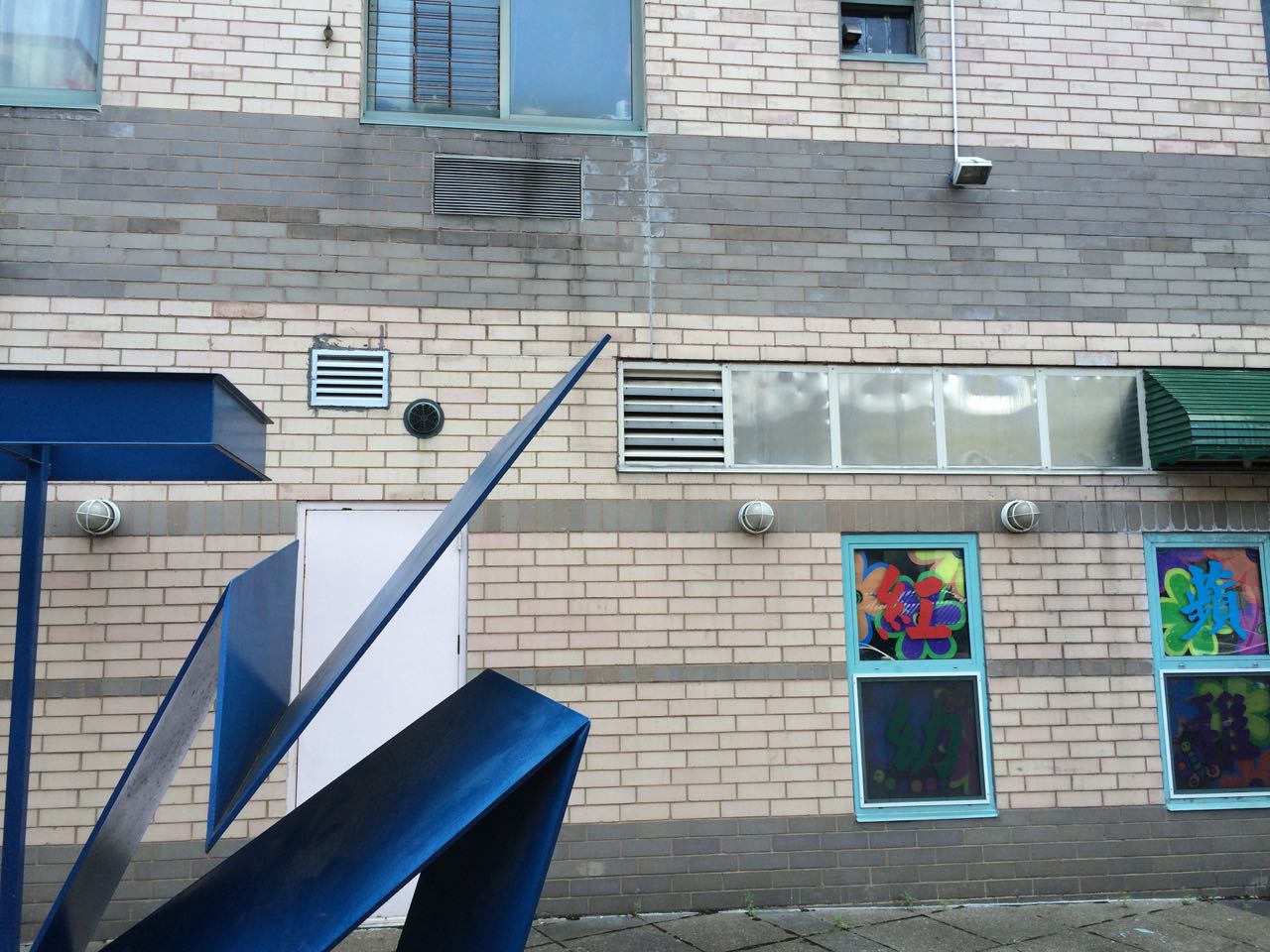
If you’re at all like me, the blank white utility door and the ventilator grille above it scream “Avoid this space.” And isn’t it interesting how often lifeless empty spaces feature an abstract modernist sculpture at the middle of them? Could it be that approaching urban space and form as though they bear (or should bear) any relationship whatsoever to contemporary art galleries is just a flat-out bad idea?

Not hard to see the lifelessness here. Cracked and stained concrete, a ripped-off stretch of the neighboring building’s side wall (which was obviously never intended to be put on display), and a general ashtray/garbage-pit-like atmosphere prevail. All for what? What has been gained by the designer and the developer having pulled their building 15 or so feet back from the sidewalk? General building-in-a-city rule: unless you have a very good reason to do otherwise, always build your structure out to the sidewalk.
Where our cities, blocks, neighborhoods and buildings go, why do we go on repeating the same simple mistakes? And why is the modernist design-and-development establishment as devoted as they are to refusing to learn from the past?
Related
- If the people who make these decisions played by David Sucher’s “3 Rules,” 90% of urban-planning-style mistakes could be avoided. Two funny things about architecture and urbanism: 1) it ain’t rocket science, and 2) we already know how to do it well.
- Back at my old blog, I interviewed David Sucher: Part One, Part Two. Buy David’s supergood guidebook here.
- Christopher Alexander is one of the great minds of this way of looking at the built world. Start with this book and with this debate between Alexander and arch-modernist Peter Eisenman.
- The mathematician and architecture theorist Nikos Salingaros is an associate of Alexander’s and is a very brilliant guy in his own right. Some years ago I interviewed Salingaros: Part One, Part Two, Part Three, Part Four, Part Five.
- Nobody makes the dreariness of so much American architecture and urbanism as vivid as James Kunstler. Here’s his blog, here’s the best book of his to start with, here’s his fun Eyesore of the Month feature.
- Alexander and Salingaros take the position that “livingness” doesn’t just exist but can be more or less scientifically established. The Luxembourgeois architect and polemicist Léon Krier is equally eye-opening and certainly plays on the same team, but he takes a poet’s approach to the question. Roger Scruton praises Krier; Salingaros maintains a page devoted to Krier and published an interview with Krier; I reviewed a wonderful book by Krier. Here’s a decent overview of Krier from The Guardian.
- Eddie Pensier had some laughs at the expense of trendiness in Sydney. Get a look at that absurd, dumb bench.
- My previous Crap Space posting.
- Blowhard, Esq. and I visited the 9-11 Memorial in lower Manhattan. Both of us were moved by the site itself but found the memorial overflashy and devoid of life. Blowhard Esq.’s posting; mine.

I think the purpose of the space is to be the local FEMA evacuation staging area. The dreariness of the location is part of their effort to break the evacuees spirit and make them accept their new life at Camp No 1435b in the west Texas desert. Who would want to go back to their old life if their last memories of it was looking at that crap space.
I give high marks to the designer for the random location of windows, ventilation, light fixtures, he is a bold spirit to ignore thousands of years of architectural practice and not even take the easy way and throw it together like a impressionist painting but to carefully place each feature in a spot where someone looking says to themselves, “that is the wrong spot for that window, door, vent, fixture, etc“. And the choice of the cheapest bricks, paving, tiles that have managed to make a relatively new building look dirty, old, decaying and abandoned. I have seen some Roman ruins which looked better.
The only thing missing from that location is a dumpster. And even that is wrong since looking at the pictures I had an almost overwhelming desire to throw something away, and was frustrated by the lack of a dumpster or even trash can. The floor drain is but a tease, too small to drop a coke can into and even a trying to get a napkin down it would take some effort.
LikeLiked by 1 person
It might not be so bad, without that awful fencing (its a little difficult to tell, outside the context of actually being there).
LikeLike
“If this space could talk, what would it be saying to you?”
Whaddaya whaddaya?
LikeLike