Desert Dweller

Blowhard, Esq. writes:

Andrew

Meet Andrew. He spent some years in the desert outside Las Vegas prospecting for gold but now he lives on the Mojave River in the Mojave Desert between Baker (25 miles away, pop. 735) and Barstow (40 miles away). He told me that only four rivers in the world flow north — the Nile is the longest and the Mojave is the shortest. We were only stopping for a second so I didn’t have but a couple minutes to talk to him. I bet he has some stories.

TheSheriff

Posted in Travel | Tagged , , , , , | 5 Comments

Facebook Follies

Callowman writes:

In the past few hours, Facebook has had the poor taste to boot several people associated with this blog out, requesting that we upload an image of a government ID to get back in. I am the latest victim.

Suddenly, Google+ is looking a whole lot better. Hell, I assume they already have all the information on my government ID, and a whole lot more to boot. They’re the perfected electronic version of the soulful Stasi snoop in The Lives of Others.

How much information do we need to supply to a free social networking site, anyway? Admittedly, I value the service they provide a great deal. Yet I’m not so sure I’m going to comply with this request. Anybody else have any sensible thoughts on the subject?

Posted in Computers | Tagged | 35 Comments

Quote Du Jour

Blowhard, Esq. writes:

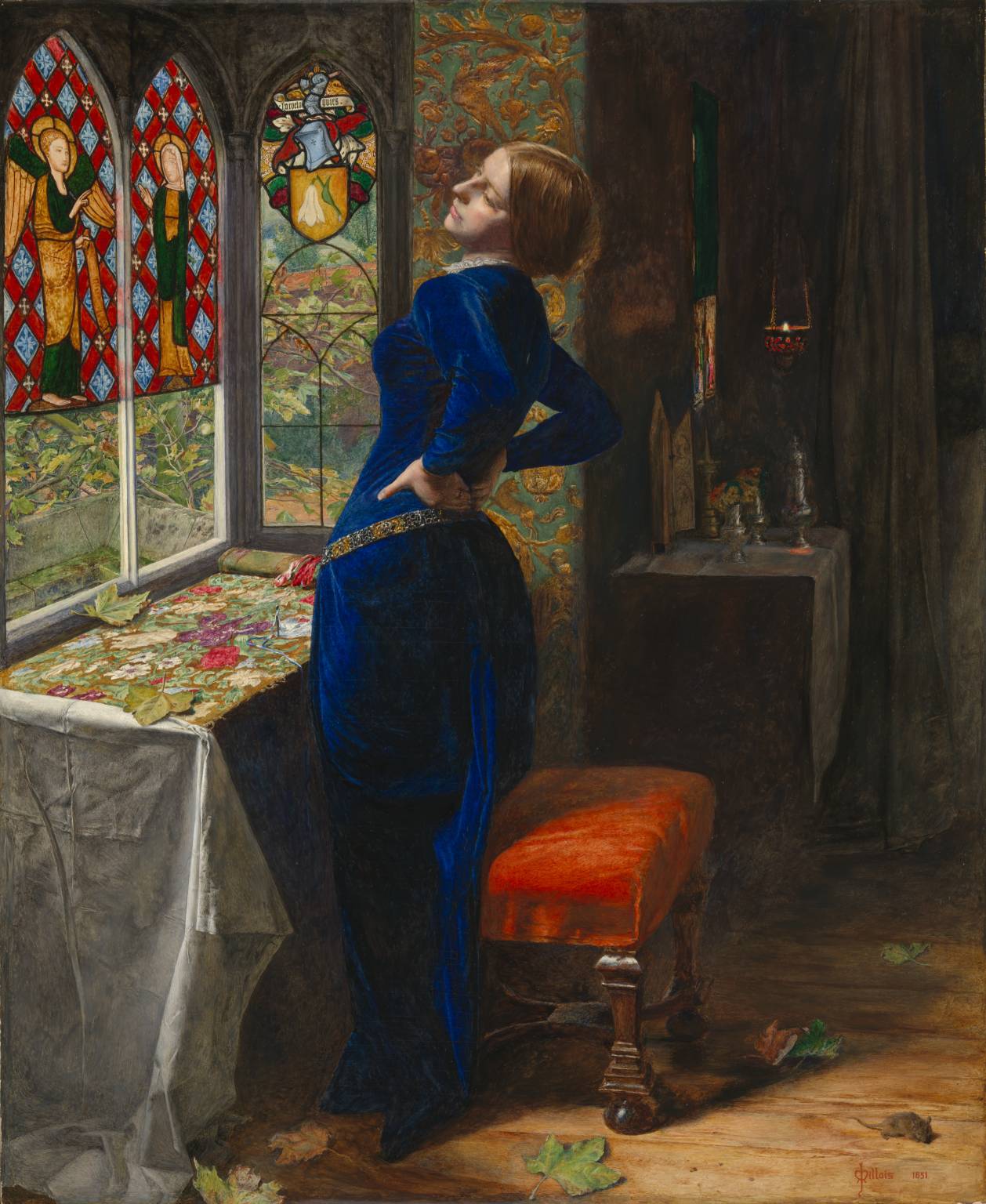
"Mariana" by Sir John Everett Millais, 1851

“Mariana” by Sir John Everett Millais, 1851

After dinner I shall perhaps feel worn out, so I shall just lie on your bosom and say nothing but feel a great deal, and you will be very loving and call me your poor child. And then you will perhaps show me your Life of St. Elizabeth, your wedding gift. And then after tea we will go up to rest! We will undress and bathe and then you will come to my room, and we will kiss and love very much, and read the psalms together, and then we will kneel down and pray in our night dresses. Oh! what solemn bliss! How hallowing! And then you will take me up in your arms, will you not? And lay me down in bed. And then you will extinguish our light and come to me! How I will open my arms to you and then sink into yours. And you will kiss me and clasp me and we will praise God alone in the dark night with His eyes shining down upon us and His love enclosing us. After a time we shall sleep!

And yet I fear you will yearn so for fuller communion that you will not be so happy as me. And I too perhaps shall yearn, frightened as I am! But every yearning will remind me of our self-denial, your sorrow for sin, your strength of repentance. And I shall glory in my yearning, please God!

— Frances Grenfell in a letter to her soon-to-be-husband Charles Kingsley about how she envisions their wedding night, 1844. Their marriage wasn’t consummated until five weeks after their wedding day.

Posted in Art, Philosophy and Religion, Sex | Tagged , , , , | 7 Comments

Iliza Shlesinger

Fabrizio del Wrongo writes:

I watched stand-up comedian Iliza Shlesinger’s film “War Paint” on Netflix streaming the other night. I admit it: I hit “play” on the Roku controller in part because the image used to advertise the movie shows Iliza in the buff. She’s an okay looking girl. Nothing like the press makes her out to be, but okay. She has a pretty interesting gimmick — a rapid-fire, almost stream-of-consciousness delivery that at times evokes Sam Kinison. She isn’t scary-funny like Kinison, though. Mostly she just wears you down. Her voice is a yappy-dog bark with a bit of growl in it, and when she can’t come up with something funny to say she makes a high-pitched goat sound. Amazingly, this gets a laugh whenever she does it. I found listening to her to be a relentlessly unpleasant experience — a bit like going to a poetry reading by a speed freak. One who is part goat.

Anyway, her demeanor and her material are worth enduring because, taken together, they make for a pretty potent portrait of contemporary femininity. More potent even than “Bridesmaids.” She has a gift for observation and description, and her stories about going out with girlfriends are spot-on evocations of the horror show that is the ’10s dating scene. Occasionally the camera will pick up a clutch of fat chicks in the audience. They seem to be laughing more in recognition than delight.

Related

  • You can watch the movie on Netflix here.
  • A profile.
  • I wrote about girliness back here.
Posted in Movies, Performers, Women men and fashion | Tagged , , , | 10 Comments

Sometimes a Picture Really is Worth a Thousand Words

epiminondas writes:

auroraiceland_vetter_1300

They do auroras right in Iceland.

Posted in Photography | 6 Comments

Architecture Then / Architecture Now: Color

Paleo Retiree writes:

Why don’t people — including critics — complain more than they do about the colorlessness of so much of what’s being designed and built these days? It’s a question that seldom comes up but that has always leaped out at me: What’s with all the white, black and gray buildings anyway? It’s not that white, black and gray weren’t used in traditional and classical architecture; they were. But in the old days they were part of a very expansive palette. (It’s peculiar that the Bad Old Days are often associated with racism and fascism because, so far as architectural color and style went, they were far more diverse than today’s world.) Yet the colorlessness of much chic architecture isn’t only seldom discussed, it’s seldom even noticed. Time to correct that.

Here’s a snap I took the other day near the West 14th Street Apple Store.
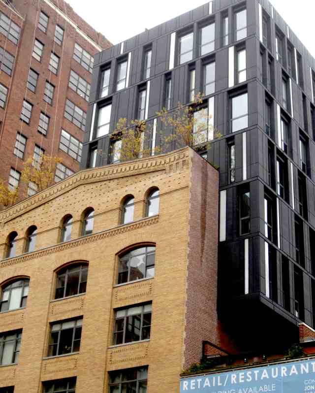
ne_nyc_2013_11_arch_color_contrast01It was an overcast day so the colors weren’t screaming. Even so: Compare the colors of the older buildings — the gold/tan of the building in the lower left and the red/orange/brown of the building in the upper left — to the black-and-gray of the all-too-typical recent addition. Which makes for the richer visual experience?

Since I often find that many people aren’t used to thinking of bricks and stones as having colors, and since I want to drive my point home here, I’ve treated myself to some fun with the eyedropper and paintbucket tools. Lower left / new addition / upper left:

color_contrast

On the left and right: loads of muted, earthy color. In the middle: all the warmth and appealingness of wet charcoal.

And don’t get me started on the topic of the sensuality of brick and stone vs. the cold impersonality of metal and glass …

Another example, shot on the same dull day:

ne_nyc_2013_11_arch_color_contrast02

Related

  • Blowhard, Esq. is a fan of the way neon signs enliven the visual atmosphere.
  • I gabbed about color (and some other general topics) in this epic, if I do say so myself, posting about Nevada City.
  • I see that the Kindle version of James Howard Kunstler’s great “Geography of Nowhere” can be had for $3.99. Now that’s a sensible way to price an ebook.
  • Dallas comes up with a seriously wacky way to solve a shiny-curved-building/death-ray problem. (Link thanks to Will S.) Here’s another way to take the problem on: How about not designing and constructing shiny, curved buildings in the first place? What do you think: Too radical?
Posted in Architecture | Tagged , , | 15 Comments

Affirmation Du Jour

Blowhard, Esq. writes:

fuckallofthisshit

Posted in Philosophy and Religion | 2 Comments

The President Relents

epiminondas writes:

I guess the pressure just got to him.

Posted in Humor, Politics and Economics | 1 Comment

Actors (etc.) in Hats and Headgear

Sherbrooke writes:

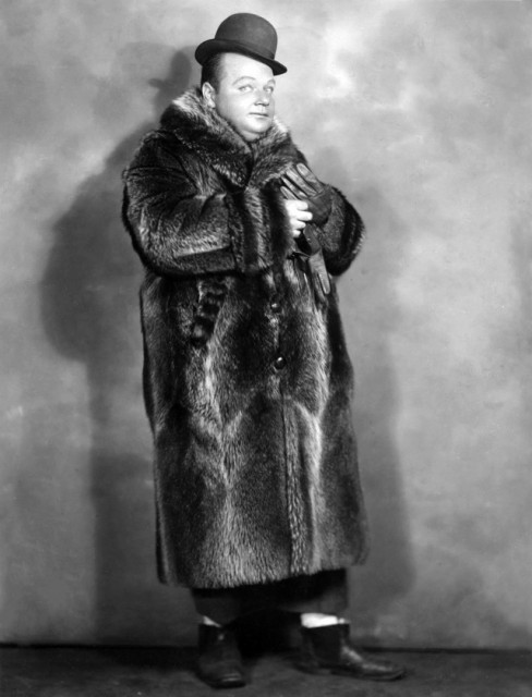
This is Roscoe (“Fatty”) Arbuckle in the 1910s.  In his shorts, he was playful and often brilliant. And in some, he had a real sense of anger, outraged dignity and sadness. (See “He Did and He Didn’t,” 1916.) Now those qualities seem prophetic. At the time this was taken, he could not have known he would shortly become film’s unluckiest actor.

Image

Posted in Movies | 2 Comments

Movie Posters of the French New Wave

Fabrizio del Wrongo writes:

As you might expect, the advent of the French New Wave in the late ’50s helped to usher in a revolution in French movie poster design, a tradition with roots going back to Jules Cheret. Offset printing replaced stone lithography as the main mode of reproduction, and photographic images began to take precedence over traditional hand-rendered designs. The designer most emblelmatic of the period was probably Rene Ferracci, who often employed photographic collages to evoke the modernist bent of the films he was attempting to represent. His designs for Godard’s “2 or 3 Things I Know About Her,” “La Chinoise,” and “Made in USA” seem pulled right out of the popular consciousness.

But vestiges of the old way of doing things remained. The legendary Boris Grinsson delivered an oddly staid, but still quite appealing, image to promote “The 400 Blows”; it captures Leaud just as he’s freezing into an icon (the movie ended with a freeze-frame, after all). And Jean Mascii’s treatments for “Alphaville” and “Lola” are unforgettable even though they largely miss the point.

Georges Allard’s Bardot portrait for “Contempt” misses the point too, but it’s so transcendent that it scarcely matters; it’s the iconic image of ’60s French cinema.

I know it’s possible to dispute the New Wave-ness of some of these movies, but let’s agree not to nitpick.

Related

Posted in Commercial art, Movies | Tagged , , , , , , , | 12 Comments