Paleo Retiree writes:
Back here I pointed out how colorless most trendy contemporary buildings are. The percentage of chic buildings that are white, gray or black is amazingly huge once you 1) start noticing it and 2) start noticing how colorful the world of traditional urbanism is by comparison. I took an amble through the Village and Chelsea the other day and, in a vague spirit of documenting these observations, fired off snaps of some of the black buildings I ran across.
First up, black glass-and-geometry in Cooper Square. I suppose its defenders would rhapsodize about its Platonic perfection, and about the bliss they feel watching it dissolve into the sky and reflect its surroundings. Me, I grew tired of those rationales for boring glassy buildings a few decades ago.
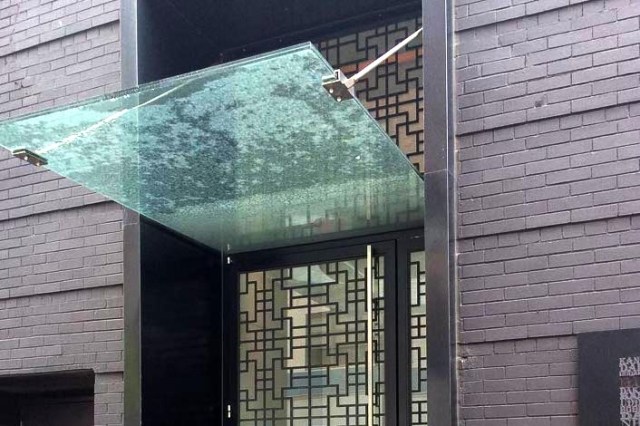
Next: I can’t think of a better thing to do with brick than paint it black, can you? And that plate-of-glass overhang has become its own tedious modern cliché too, hasn’t it?
Not far away was more brick-painted-black. Only the design community would think of it as a good idea. (OK, the Irish-pub community would too, but that’s for another posting.)
A recently-finished arrival in the West Village: Black brick, super-reflective windows, and trendy wibbly-wobbliness. Why? Well, just because. (In fact, the wibbly wobbliness we’re seeing so much of these days is supposed to correct some of what was widely acknowledged to be wrong with early modernist buildings — their maniacal emphasis on lines, planes and rectilinear geometry.) To my eyes this particular building looks like a just-washed piece of belly-dancing fabric hung out on the line to dry in the breeze.
What could be more welcoming than an apartment building that seems to be made of black plastic?
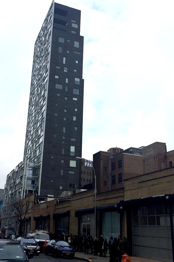
Chicly arbitrary window perforations near the High Line, as part of a “2001”-esque slab looming above a block of warehouses and galleries:
Time for a historical note: Let us not forget the horrors of Brutalism. I sometimes want to search out the guys who came up with dumb ideas like this one (“Hey, let’s make a bunker-like building out of charcoal-colored concrete blocks! It’ll be raw, powerful and masculine!”) and ask him what he thinks of his work these days.
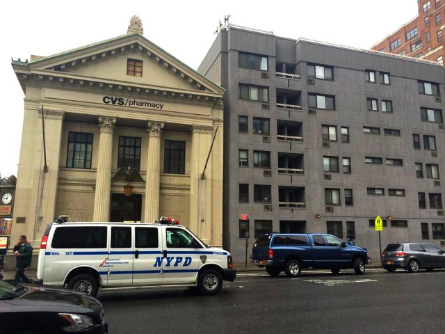
And a quick reminder of 1) how much many chic contempo buildings resemble stylish kitchen appliances, and 2) how colorful traditional buildings often were and are:
 Why do our designers, developers and architects want us inhabiting a colorless world? Note to the design community: Darth Vader was a bad guy. Don’t use him as your style icon.
Related
- Blowhard, Esq. on the pleasures of brick.
- Fabrizio kicked off a fun comments-thread with his review of the movie “Brick.”
- A posting of mine in praise of the (very colorful) traditional town of Nevada City, CA.
- There’s a lot of color in Blowhard, Esq.’s snapz of Placerville, CA too.


Apparently many architects liked the Monolith from ‘2001’. Ick.
LikeLike
The taste-set that the academic-establishment architecture world cultivates and promotes is a seriously weird one. I understand and get it so far as “design” goes — objects in your house (ash trays, perfume bottles, lamps), or magazine and ad design. But for buildings and neighborhoods, no thank you.
LikeLike
I find those shiny black blocks menacing. The post is excellent, good work.
LikeLike
Thanks, glad you enjoyed, thanks for stopping by.
LikeLike
The very black Toronto-Dominion Centre in (guess where) Toronto, designed by Mies van der Rohe, has been with us since its first tower went up in 1967. It’s possible to take a fab glamour nighttime shot of these buildings and insert it right into the opening sequence of “Manhattan.” But not many people see or use those towers (which are purely commercial) at night, and their actual experience is more relevant. Buildings must function for human beings–and a great building should not just serve these lives, but enhance them. Which, in the case of the T-D Centre, would be the lives of the people doing business inside them and the people walking past them.
I had the dubious pleasure of working in the T-D Centre dozens of times (temp services kept me alive for decades). The towers and offices inside them are identical, soulless, unforgiving, featureless and drab. (Did I leave anything out?) And this is a building (or rather, collection of them) that is actually made with great materials–nothing cheap about the T-D Centre, except when it comes to the human front. And that’s where all the buildings that Paleo mentions fail–fail badly. It’s a huge shock to me whenever I visit New York and see this architectural crap. Done on the cheap or done with only the best materials, it’s a blight on the city. It’s ALL brutal, all inexpressive, and it shows no sophistication at all. Quite the opposite; it’s group-think and it’s dumb. These architects are designing buildings without understanding what a building is all about in the first place–Shelter. Mingling. Community. Usefulness. Pleasure and well-being.
LikeLike
Rant Du Jour. Wish I had it in me to be that eloquent, tks.
Anyway, that’s it entirely. As a friend of mine likes to say, what’s really important about a building isn’t so much how it looks, it’s how it behaves. How does it treat us? Is it friendly? Helpful? Does it put on airs? Of what kind? Is it considerate to its neighbors? Etc, etc.
Once people get that and tune into it, the whole world of architecture seems to open up to them. It’s just like reacting to, making sense of and judging people. Enjoying (and “getting”) architecture and urbanism isn’t about art appreciation in the criticism-and-academia, formalistic, isolated-aesthetic-object sense. (Which is 90% a crock anyway, IMHO.) It’s about a widely-shared, down to earth instinct for how you’re being treated.
So far as looks and style go: well, they’re important too, but in a secondary way. The trad town and city look the way they do not because (in most cases anyway) anyone “designed” them from the top down but because that’s what a town or city looks like that’s actually been built (and has grown) to treat humans well. It’s grown and evolved in response to real human energies, needs, understandings, traditions and pleasures. And what we’ve got before us (and around us) is the result of that evolutionary process. It’s more akin to a coral reef than it is to a sculpture in an art gallery.
One of the many tragedies of the modernist line in architecture is that it’s been all about giving primacy to visual impact — to “design.” (Well, to design and stunt-engineering.) Screw the human side of things — doesn’t this make for a smashing photograph? As though the magazine spread on the building is more important than the way the building treats us. They keep insisting on treating (and creating, and discussing) buildings as sculptures-on-pedestals-in-art-galleries. As though that’s a good thing, an advance, rather than a huge and destructive misconception. And they continue to keep many people buffalo’d.
I do wish something like the locavore movement would catch fire where architecture-and-urbanism goes, and I’m surprised that hasn’t happened. Any hunches about why we haven’t seen such a thing?
LikeLike
Our contemporary architects used to build the most useless theatres, without adequate fly space, wing space, acoustics, and sight lines. Somehow, the light bulb went on above someone’s head this wasn’t really smart, and some excellent theatres were built here and there. In these theatres, anyone, of any height, could see and hear the whole production from any seat. And the tech crew could actually do their jobs!
The Princess of Wales in Toronto was one of these theatres (and it’s being torn down now. Not enough touring productions on the scale of The Lion King and Phantom to keep it going.) The Princess let the production reach every single member of the audience. Equally great (if you’re female), it made it possible for women to get in and out of the ladies’ room in under 2 minutes–no more lines of fifty, staring resentfully at the men who dashed in and out of the men’s room and still had time for a drink before intermission ended.
Why the penny hasn’t dropped that ALL buildings should serve human needs is beyond me.
The Royal Ontario Museum in Toronto got a new addition in the last decade that is supposed to resemble an exploding crystal. Problem is, no crystal could ever be so heavy, or a fraction as ugly. And how does it work for the museum? You guessed it. Turns out it’s really, really hard to display precious objects in it so that the objects are protected and people can see them. The thing is like a toaster that can’t make toast.
“As a friend of mine likes to say, what’s really important about a building isn’t so much how it looks, it’s how it behaves. How does it treat us? Is it friendly? Helpful? Does it put on airs? Of what kind? Is it considerate to its neighbors? ” That’s beautifully said.
LikeLike
Pingback: Passing Thoughts on the High Line | Uncouth Reflections
Pingback: Architecture Du Jour | Uncouth Reflections
Pingback: Non-Color at the High Line | Uncouth Reflections