
Paleo Retiree writes:
On a beautiful recent day, my wife and I treated ourselves to a long, leisurely walk — first through the West Village, then down along Hudson River Park, and finally through and beyond Battery Park Marina. The red line shows our route:
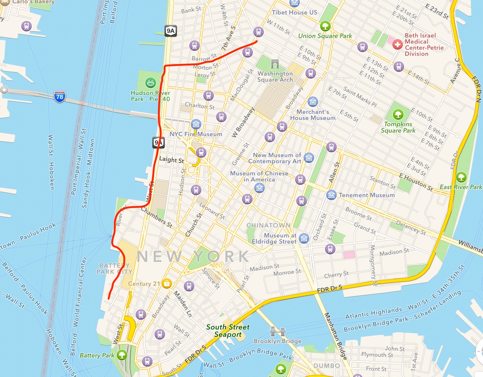
At a moseying-along pace with regular breaks for zig-zaggin’ and snapshootin’, that’s about a 70 minute walk, with another 70 minutes for an amblin’ return.
Greenwich Village, of course, is one of the U.S.’s great urban neighborhoods. It’s old, and it’s an endless source of beauty and delight. The stretch along the west side — by the Hudson River and south towards the tip of the island — is quite different. It’s been developed during recent decades; what was once a squalid waterfront explored only by the brave and the foolhardy is now a SWPL-friendly series of parks, spaces and fashionable high rises. It isn’t quite as well-known as the High Line, but it’s a similar sort of up-to-date urban success story. On a nice day the stretch is full of sunbathers, joggers, strollers, bicyclists and Frisbee fans, as well as people just hanging out, picnicking and kicking back.
As an everyday New Yorker, I’m happy to admit that I really, really like being able to walk along the Hudson, and that I use and visit the area regularly. As a traditionalist and reactionary where architecture and urbanism go (not really, but I do enjoy playing the role), I couldn’t resist fixating on some of the area’s failures. I also couldn’t help wishing the whole thing were even better than it is.
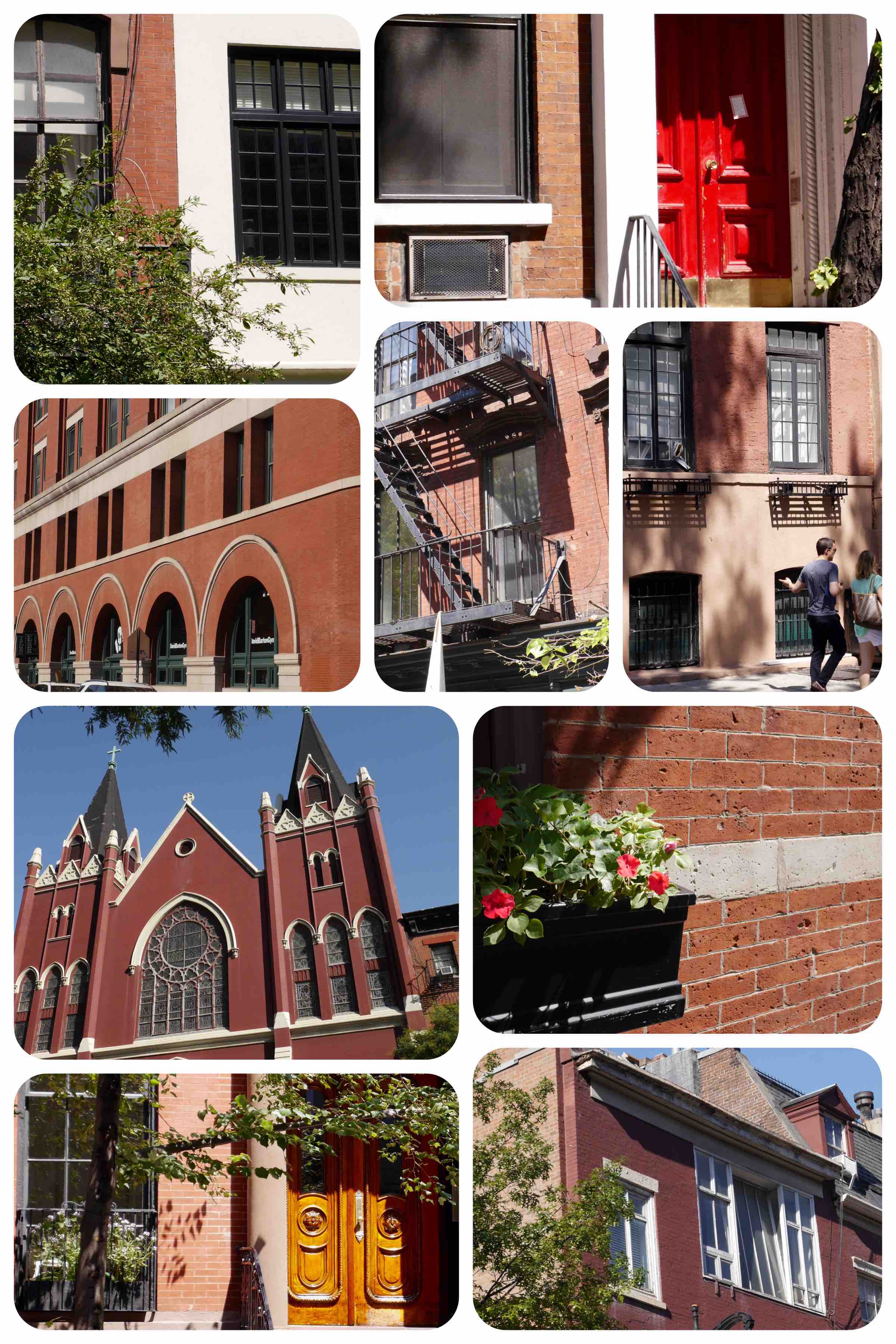
Some impressions, first of trad buildings in the Village …
… and next of some recently-built stuff along the west side:
 I’ve ranted about color before. Short version: a trad environment will almost always be more colorful and visually warmer than a modernist one. Given that color means vibrancy and life, why on earth are modernists so determined to sentence us to such an ashes-and-bones, monochrome existence? But what I want to focus on in this posting are two other things.
The first: Forget color and look at texture and richness instead. One of the claims modernists like to make for their work is how wonderfully sculptural it is. Forgive me, but I just don’t see it … unless by “sculptural” what you really mean is “Minimalist,” and unless the only sculptors you’re thinking of are Minimalists like Donald Judd, Tony Smith and Carl Andre. But what an incredibly narrow view of sculpture! In my collage of Village snaps I see massive amounts of 3-D depth, light-play, texture, materiality and complexity. In my pix of the newer structures I see not much beyond abstract geometry: planes, lines and curves. While the trad neighborhood is a hands-on, soul-nourishing festival of color, light, forms and materials, the modernist one is all intellect, meetings-and-memos, stencils and graph paper. It’s the difference between real life and a videogame, food you can eat and a magazine feature about a trendy restaurant.
More specifically — fair warning: Andy Roony moment incoming — what is this obsession that the design world currently has with acute angles, sharp edges and stabby-pointiness? Evidence from other walks I’ve taken recently:

All these ultra-sharp edges and points jutting out at me don’t give me warm feelings, let alone help situate me emotionally and imaginatively in a specific place. Instead they make me aware of the vulnerability of flesh and bone; they create anxiety; they make me feel like I’m lost in a brain-scrambling, eye-snagging BMW ad that’s running in markets all around the world.
I suppose that if you’re someone who shares the architecture-and-planning establishment’s taste for crispness, whooshiness, blankness, semi-transparency, zip, surfaces and other such graphic-design qualities, then it all might seem fashionable and thrilling: “Blade Runner,” yes, but fun! The rest of us can be excused if we occasionally wonder why these threatening forms, twinkly-cold materials and aggressively unfriendly shapes are being imposed on us in such quantities these days. We can also be excused for suspecting that this particular style is likely to start looking pretty stupid in a very short period of time. Trends don’t usually have long lifespans, and, with buildings and parks and such, you’re then stuck with the dated silliness for decades. You can’t just toss ’em out and replace ’em with an up-to-date closetful of goodies every season, after all.
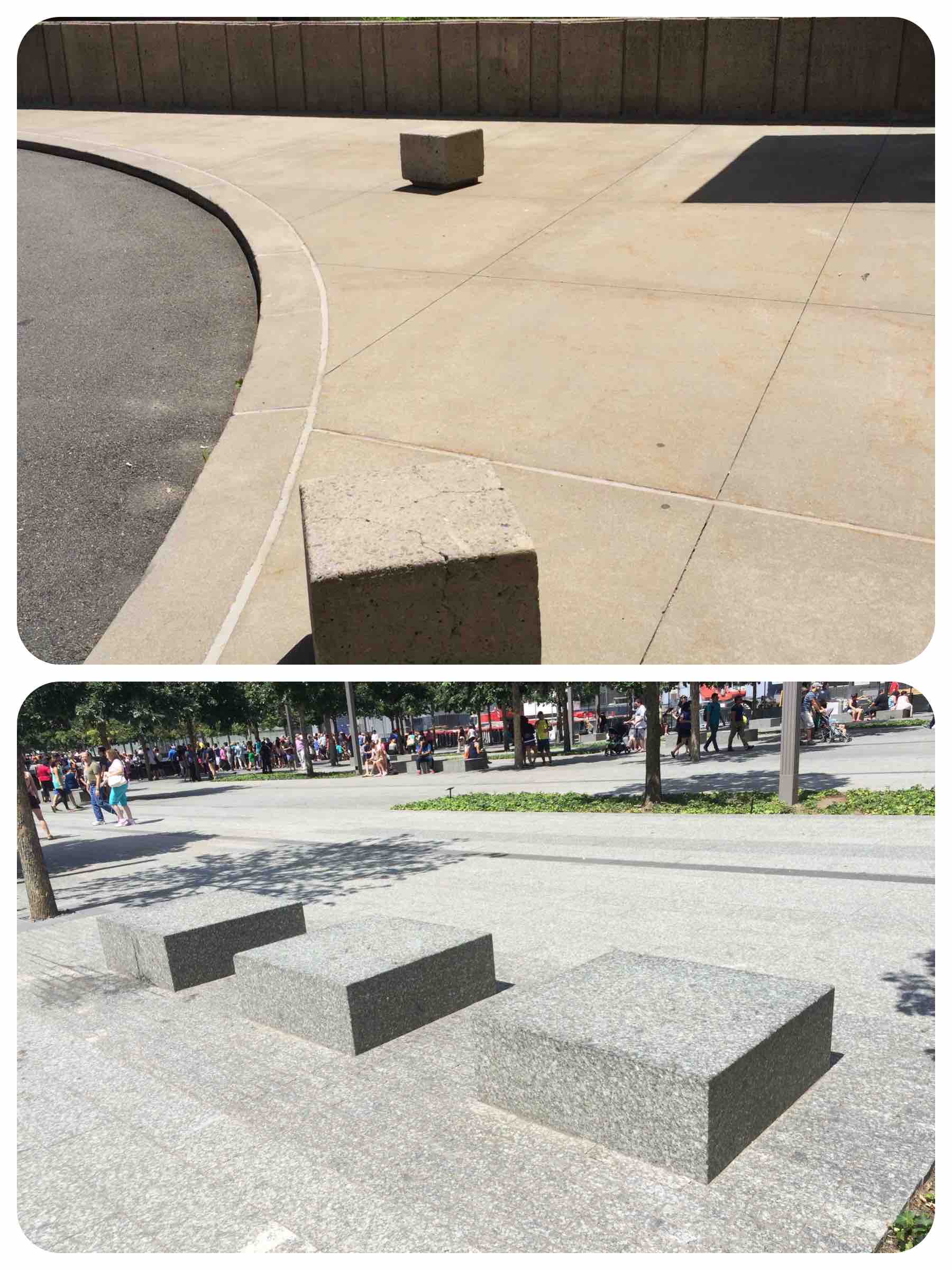
The other thing my walk left me wanting to whine about is those sculptural seats set among the stairs in the modernist-corporate plaza. Yup, that’s meant to be seating for the public. As you can see, despite the beauty of the day not a soul was using those seats. Now look at the right-hand side of the same photo. On the level above, there are people taking their ease. Here’s that same upper level, seen from another angle and snapped just a few seconds later:

I’m not wild about the rigid geometry and the mystery materials that space is made of, but I gotta grant that people are using it, and that they seem to be enjoying themselves. Why? What factors contribute to the difference?
It could be that these people are choosing to spend their time up here and not down on the lower level simply because this upper level is closer to buildings and shops. But it could also be that, generally speaking, people simply don’t like immovable, Minimalist-sculpture-style public seating, and that they especially don’t like Minimalist-sculpture-style public seating when it’s situated out in the middle of a blank nowhere. Too radical a thought?
As you might guess, I lean towards the second explanation. In support of my theory, here’s some evidence that I snapped recently in other parts of the city:
Similarly beautiful days, as well as a similarly complete absence of the public choosing to make use of the public seating on offer.
For contrast, here are some other public-seating scenes I’ve recently run across:
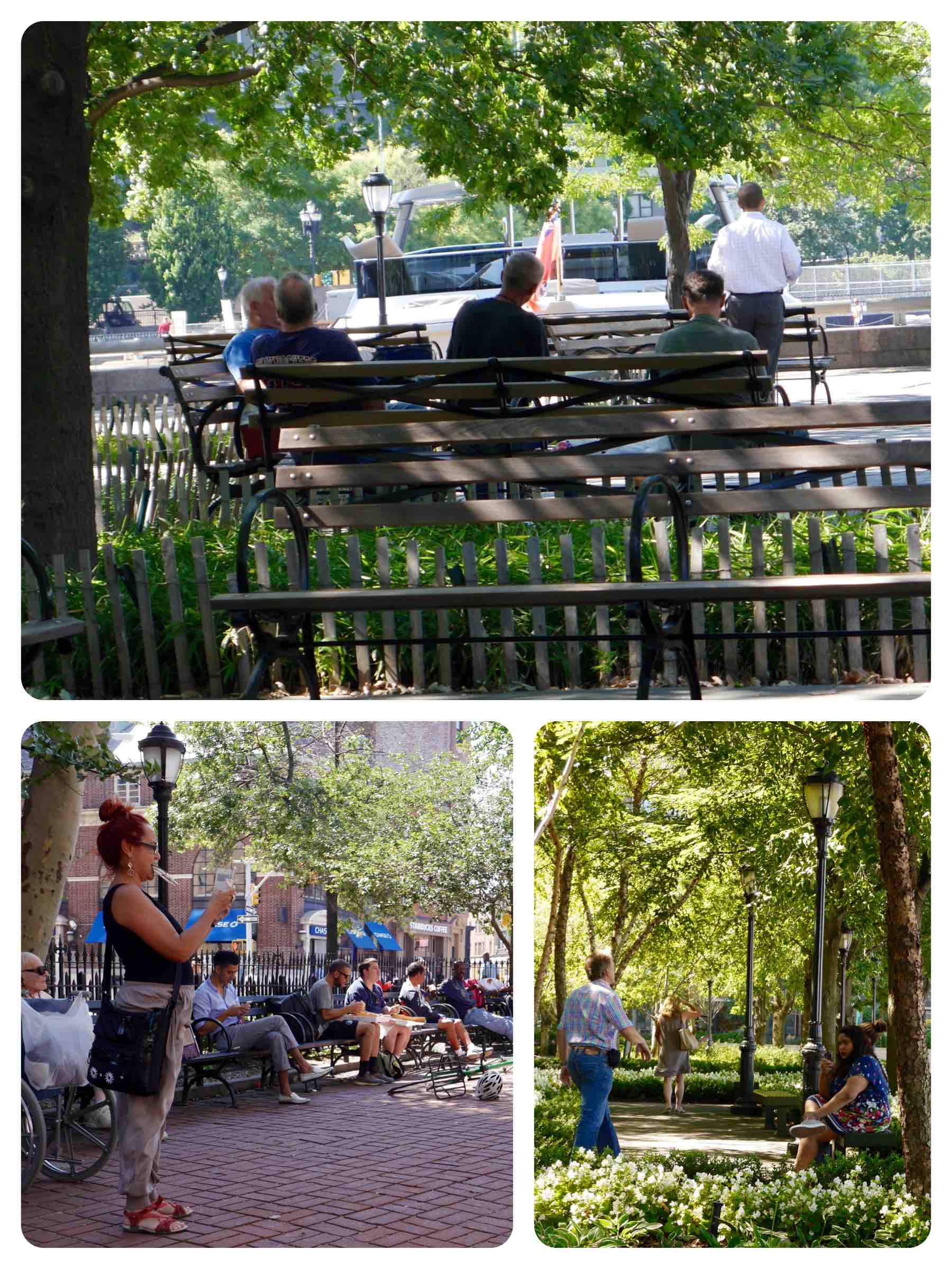
As someone who isn’t mesmerized by modernist architecture-and-design values, I’m going to permit myself to wonder out loud: Why don’t our planners, designers, architects and such wake up to the fact that everyday people prefer traditional benches and chairs to Minimalist slabs? And that everyday people also enjoy it when traditional seating is located close to trees and other greenery that can supply shade and natural-esque visual delight?
The fad for godawful Minimalist-block-style public seating has been going on for ages, by the way. The concrete boxes, er, seats in the yellowish pic were created back in the really horrifying “Brutalist” days of 1964. That’s a half-century ago now. Question Du Jour: Why does it take the planning/architecture/design world so long to admit that they’ve made a mistake, let go and move on?
Let me share the general little culture-lesson that I took from my stroll: Traditional architecture, like traditionalism-based culture generally, starts with the human factor — with forms, shapes, genres and things (paths, columns, benches, fountains, gates, etc.) that have developed over millennia because they have proven themselves to work — and then finds ways to adapt those elements to the specifics of a given project. Traditional culture works the way evolution does, in other words. And the creativity in a traditionalism-based approach doesn’t go into showstopping, wannabe-a-genius form-invention; instead it goes into adapting what history has given us to work with to current conditions, needs and pleasures. The modernist approach (which at this point is thoroughly mixed-up with the neoliberal/globalist/corporate world) is the complete reverse: to start with the conceptual (plans, geometry, manifestos, schemes, programs, CAD, etc), and then, as a concession and often at quite a late phase in the process, to throw in some elements that might humanize the project a little. It’s an abstraction-driven and top-down way of going about things. It’s Hillary and GWB. It’s the 1% sugar-coating what suits them so the rest of us will swallow it. No wonder so many of its products reek of finance and death.
In all honesty, with this Hudson River stretch as with the High Line, the designers and developers have been relatively successful in making their blah corporate modernism palatable. But, you know, it’s taken the modernist establishment an awfully long time to rediscover the humanist wheel. Given that in many ways all that’s really been accomplished is getting back to some of what we’d always been doing anyway, has it really been worth the decades of experimentation, mistakes, reforms and fads? All that excitement, patooie … Perhaps we’d have been better off simply not throwing the traditionalist approach out. Perhaps the root mistake was choosing to veer off in the modernist direction in the first place.
Architectural modernism is the art form that never stops trying to redeem itself. “This time we’ve got it right! Oh, shit, whoops … OK, now we’ve finally got it right!” … and on and on, over and over, decade after decade. So what’s with all the efforts to redeem, let alone save, it? What favors has it ever done us? Why cut it any slack at all? Why not acknowledge that architectural modernism has been a gargantuan mistake, perhaps even the greatest and most destructive mistake in the whole history of culture, chuck it and get back to the more modest, human-based way of proceeding that has always served us well?
Related
- Blowhard, Esq. takes a tour of L.A.’s Deco landmarks.
- His walk around the Santa Ana Civic Center reveals one stretch of Crap Space after another.
- Long Beach’s Civic Center may be even more dreary.
- I wrote a love letter to some smalltown porches …
- … and was prompted by a visit to California’s Gold Country to venture some Deep Thoughts.
- What’s so bad about a little architectural kitsch?
- If you’re intrigued by this way of reacting to and thinking about architecture and urbanism, why not explore some of the sensible, brilliant people whose ideas I’m piggybacking on: Leon Krier; James Kunstler; Andres Duany, Elizabeth Plater-Zyberk and Jeff Speck; and Christopher Alexander. The books I’ve linked to are all pleasurable reads; they can also be, if the moment is right for you, completely mind-blowing. They’ll lead you on to many other terrific thinkers, critics, writers and architects too.
- Some very rewarding, first-class blogs: David Brussat, John Massengale, Urban Kchoze, and Andrew Price.

I was going to comment how this “fad” for brutalist design in outdoor spaces has lasted many decades, but then you bring up that point later on. I don’t see it ending any time soon. That and the lack of color I can only attribute to economics. It’s gotta be cheaper to build like this, or this style would not have endured for longer than I’ve been alive.
LikeLiked by 3 people
You may well be right, but still I wonder: are traditional park benches really all that expensive? Are trad fountains and paths really more expensive than crowd-control-driven spaces, geometry and minimalist sculptures? My own guess is that the explanation has more to do with a mixture of things: of the processes whereby these projects come into being these days (all those committees, checklists, deals and presentations) and the rather bizarre tastes (for neutrals, fads, abstractions and such) that are inculcated into people in architecture and planning schools. I’d love to hear from someone in the field about it, in any case.
LikeLike
I would love to know as well. A very brief googling brought me to this really interesting article (http://www.frontporchrepublic.com/2014/07/architecture-urbanism-traditional-vs-modern/). A choice quote:
“Much of the character of modern architecture and urbanism, and how and why modern architecture and urbanism differ from traditional architecture and urbanism, can be explained by what I call Bess’s Law of Architecture and Urbanism, and its Corollary. The Law is:
Architecture always symbolizes power, and the aspiration of its makers to legitimate authority.
and the Corollary is:
A widespread desire for and expectation of social predictability from everyone else (the culture of bureaucracy) combined with a widespread desire for and expectation of maximum freedom for oneself (the culture of personal autonomy) will never produce a beautiful, coherent, and intelligible public realm.”
And this:
“But there are also differences between traditional cities and modern cities, and perhaps the most fundamental difference between them is that inhabitants of traditional cities generally understood themselves and their cities to be grounded in sacred order; whereas inhabitants of modern cities understand (correctly) their cities and suburbs to be expressions of corporate and individual will-to-power, though these are usually described as ‘market forces’ and ‘individual choice.'”
LikeLike
Jeez, that article explains almost all of my unease with suburbia and modern public spaces, this passage in particular:
“But the most popular and pervasive physical expression of contemporary individualist culture is the post-WWII American suburb, which manifests the ideal of a freestanding house in the natural landscape.
There is nothing intrinsically wrong with this ideal, and it actually has a long history in Western culture; but until the eighteenth century it was pretty much an exclusively aristocratic ideal, valued typically as a temporary respite from urban life. However, when that ideal became democratized in the modern era in opposition to the Industrial City, it set off a series of historical events the result of which is not an agricultural landscape dotted with grand or modest villas, but rather a “middle landscape,” neither rural nor urban, that practically everywhere looks like contemporary Long Island, New Jersey, and suburban Atlanta. Such automobile suburbs are what Americans since 1945 have been building almost exclusively, and exporting to the rest of the world — and are correctly understood as a physical embodiment of the inherent democratic cultural tendency toward individualism identified by Tocqueville, one made materially possible by government policies and the proliferation of the automobile. The post-1945 suburb is a world of unprecedented private luxury that is simultaneously and strikingly a world of unprecedented public spatial poverty, literally an anti-spatial environment, a world in which the public realm doesn’t matter.”
I admit to not having read much about architecture and city planning, so maybe this is old hat to some, but I highly recommend checking out the article.
LikeLike
Pingback: Streetcar Suburb Summer | Uncouth Reflections