
Blowhard, Esq. writes:
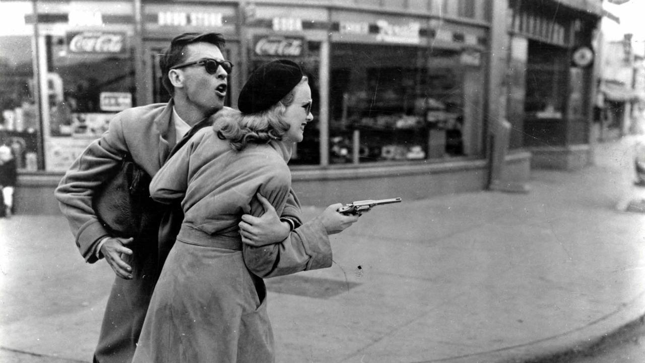
John Dall and Peggy Cummins in Joseph Lewis’s GUN CRAZY (1950).
Click on the image to enlarge.
Blowhard, Esq. writes:
John Dall and Peggy Cummins in Joseph Lewis’s GUN CRAZY (1950).
Click on the image to enlarge.
Fenster writes:
Blowhard, Esq. writes:

Over at BoingBoing Mark Dery suggests that it’s time to get back in touch with our guilt and shame when it comes to certain things:
Guilty pleasures are all about cognitive dissonance. When I say Thomas Harris novels like Silence of the Lambs and Red Dragon are one of my guilty pleasures, it’s not because I’m a holdover from a bygone era when People Like Us believed “in some kind of universal taste” or because I’m a closet snob who’s secretly “most comfortable in the elite precincts of high art”; it’s because I’m genuinely ambivalent about Harris. I want to nuance my affection, locate it somewhere on the grayscale spectrum between the black-or-white binaries of love and loathing.
My knee-jerk reaction upon hearing the phrase “guilty pleasure” is to be one of those people who says, “No no, one shouldn’t feel guilt about any pleasure,” but Dery is making me reassess my position because I think contemporary fanboy culture could use a healthy dose of ambivalence and cognitive dissonance.
As Fabrizio has observed in conversations I’ve had with him, and as Kevin Smith also points out in his interview with Bret Easton Ellis, is dispiriting how many fanboys turn art into a proxy for sports or politics. A movie or album is either The Greatest Thing Ever or a Piece of Shit. There’s no in-between — it’s like they’re rooting for a favorite presidential candidate or against a hated rival team. Sure, I get the appeal of loyal tribalism and don’t at all dismiss it, but isn’t one of the great things about art the fact that it defies such easy on-or-off categorization? You’d think so but I come across so many people today for whom nuance just doesn’t compute. Movie critic Matt Zoller Seitz has complained about the same thing. He once tweeted: <<[Banjo twang] “Gather ’round, y’all! I’m a-gonna tell ya a story ’bout a thing people used to know how to read: a ‘mixed review.'”>>
Related
Blowhard, Esq. writes:

The NYC Mercury in Chicago, 1936. Via the Facebook group Atomic Samba.
Click on the image to enlarge.
Blowhard, Esq. writes:

…Miriam Hopkins.
Click on the image to enlarge.
Fabrizio del Wrongo writes:
Belgium
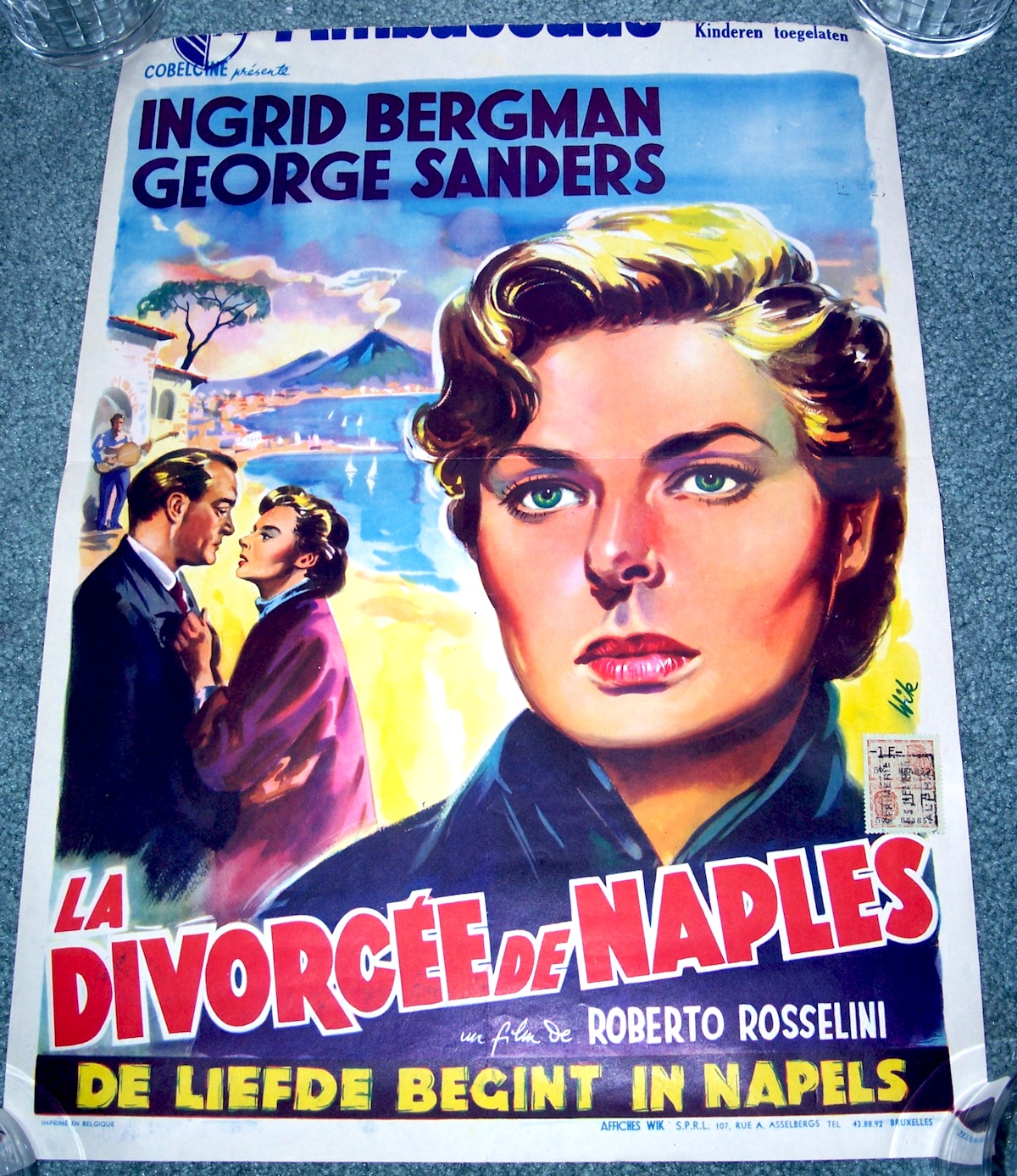
France

Boris Grinsson’s portrait for the French poster anticipates his iconic design for “The 400 Blows.”
Blowhard, Esq. writes:
Sometimes a song runs through your head all day and it drives you crazy. Other times you don’t mind at all.
Blowhard, Esq. writes:
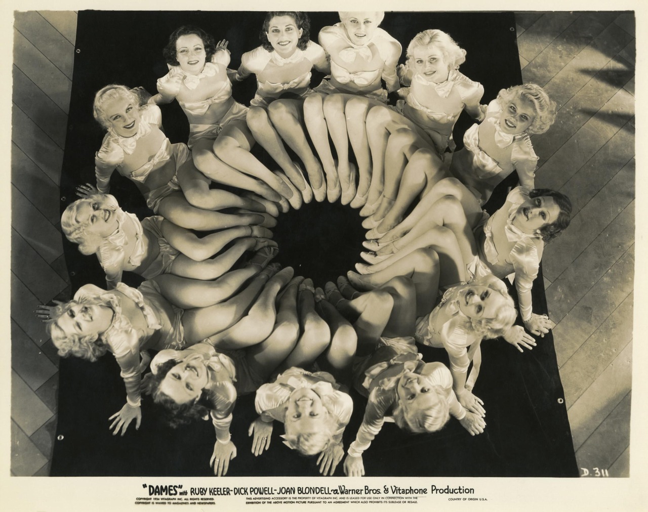
Ray Enright’s and Busby Berkeley’s DAMES (1934), from a screenplay by Delmar Daves.
Here’s the second number from the film, “I Only Have Eyes for You”:
Related
Blowhard, Esq. writes:
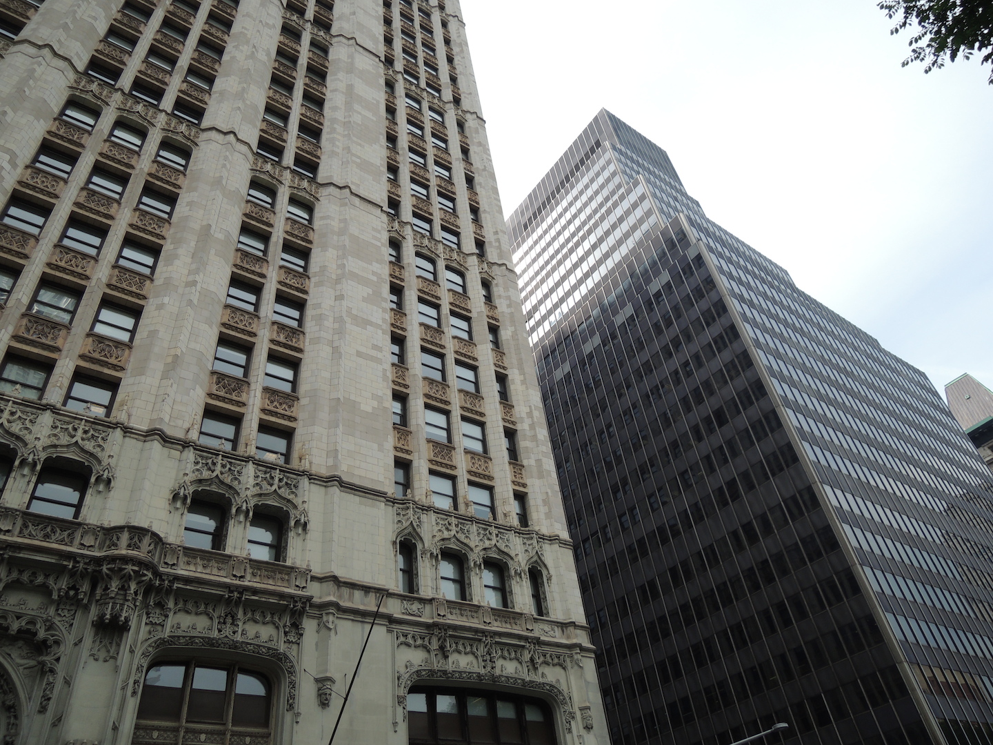
I spend more time than is probably healthy trolling providing constructive comments in various reddit architectural forums. There are lots of contemporary architecture fans around there and one thing I see constantly is their enthusiasm for contrast of a very specific type — a traditional building juxtaposed with a Modernist/contemporary one, like the picture above or the other example below.
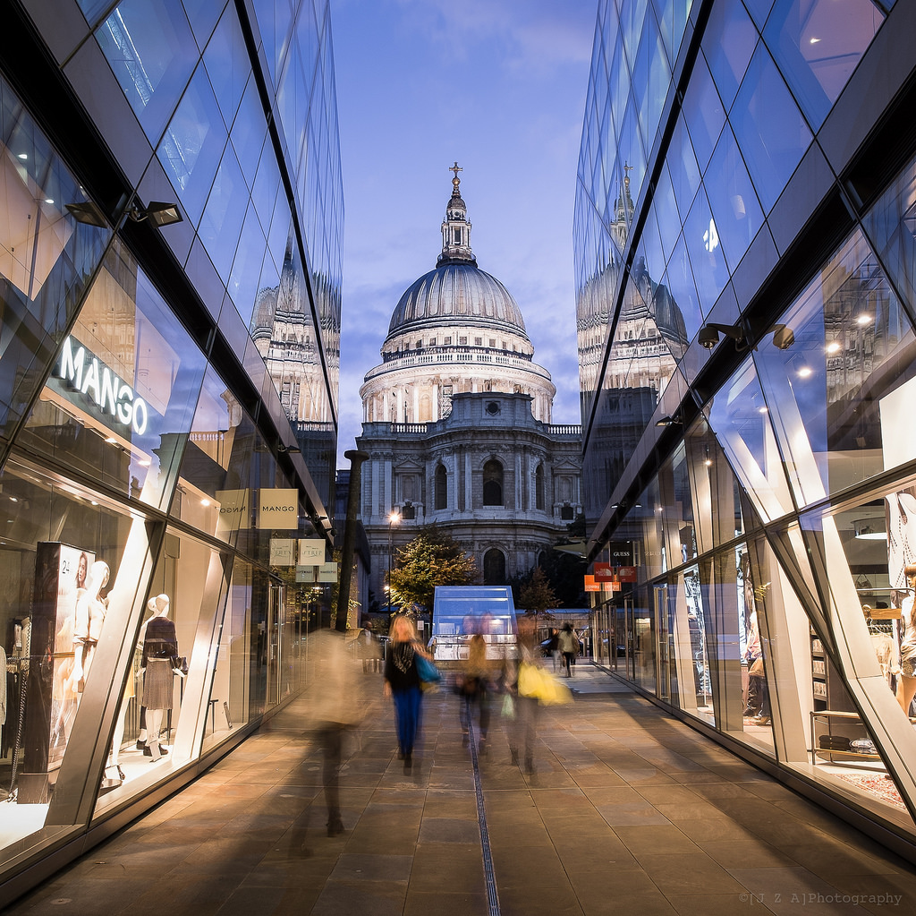
I’m always sort of baffled when people ooh and ahh over this kind of thing, as if putting a contempo building next to a classical one is a good in itself. Contrasting St. Paul’s with a steel-and-glass box may make for a interesting photograph, but what exactly do the buildings gain from it? What’s the point? They aren’t talking to one another, they’re not having any kind of artistic exchange. In the example above, nothing about the contempo structure echoes, references, or responds to any of the elements in the cathedral. It’s like walking into a room in which two people are having a loud, contentious argument where neither is listening to the other.
Instead, ignore the glass towers in the background and compare the foregrounded buildings on the street in the picture below.

This is what I think of when I hear the phrase “architectural contrast.” There’s a dialogue between the buildings in which the materials, shapes, and colors complement, elaborate on, and extend one another. Notice how the pointed arches of the building on the far left are echoed on the first story of the middle building, but the middle supports the arches on two columns. Or how the striped brickwork of the two buildings on the far right complement one another. Each building is like a different movement of a symphony whereas in the St. Paul’s picture above, it’s like some shoved a Kraftwerk song in the middle of a Bach performance. I may like “Autobahn” but I wouldn’t splice it into the “Mass in B minor.”

I wonder if the popularity of the shuffling on iPods, fusion cuisine, and genre mashups have given people more a taste or appreciation for mixed traditional-Modernist neighborhoods. If the postmodern jumble works for music, food, books, and movies, why shouldn’t a toss-it-all-in-the-air approach also be applied to architecture? It sometimes feels like the mashup is one of our most vital cultural expressions.
Will the pendulum ever swing back away from the stylistic free-for-all? When “contrast” becomes the dominant style will someone finally prod architects to contrast contrast — bring everything full circle — and return to harmony? It can’t happen fast enough for me.

Related

